Overview
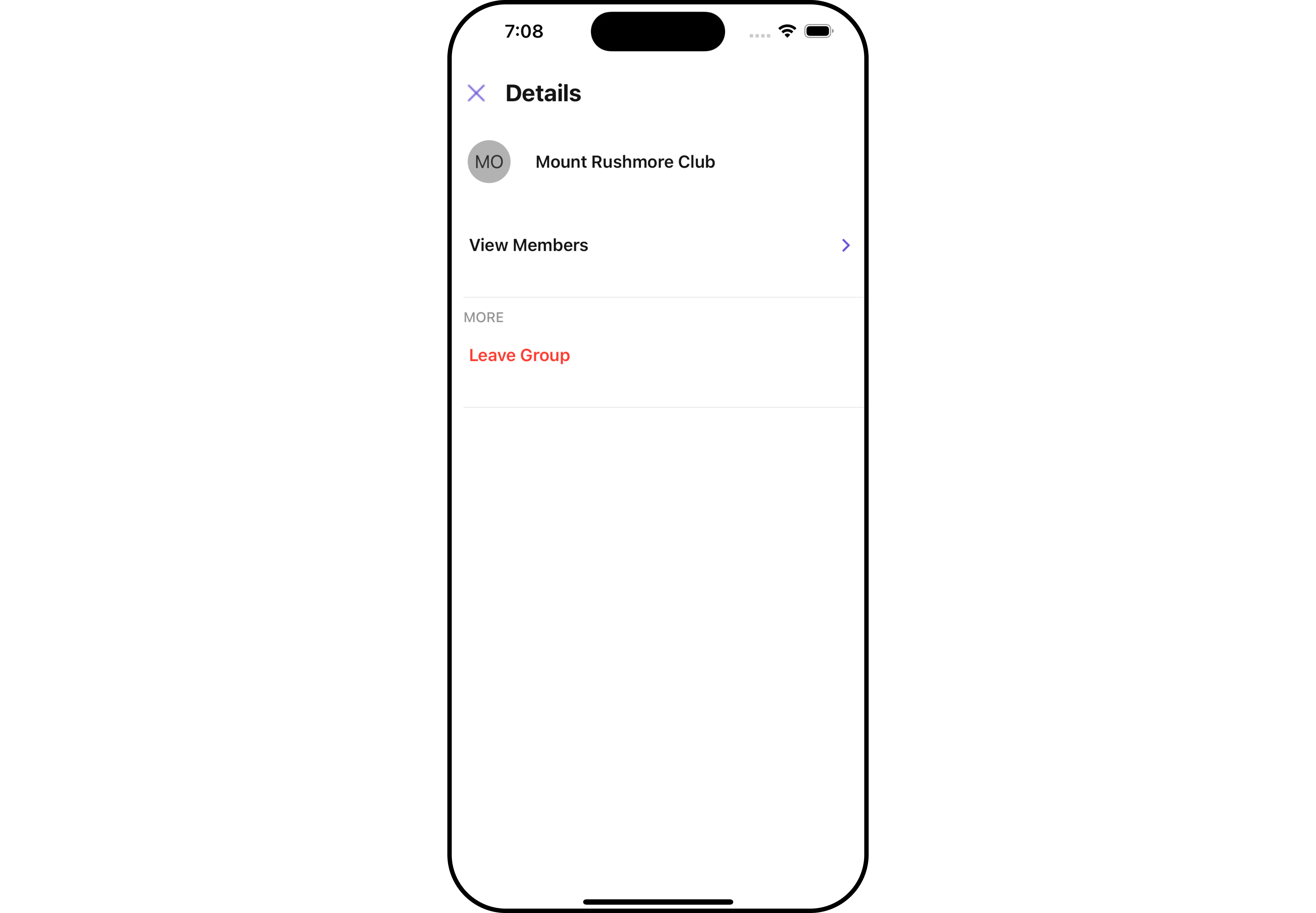
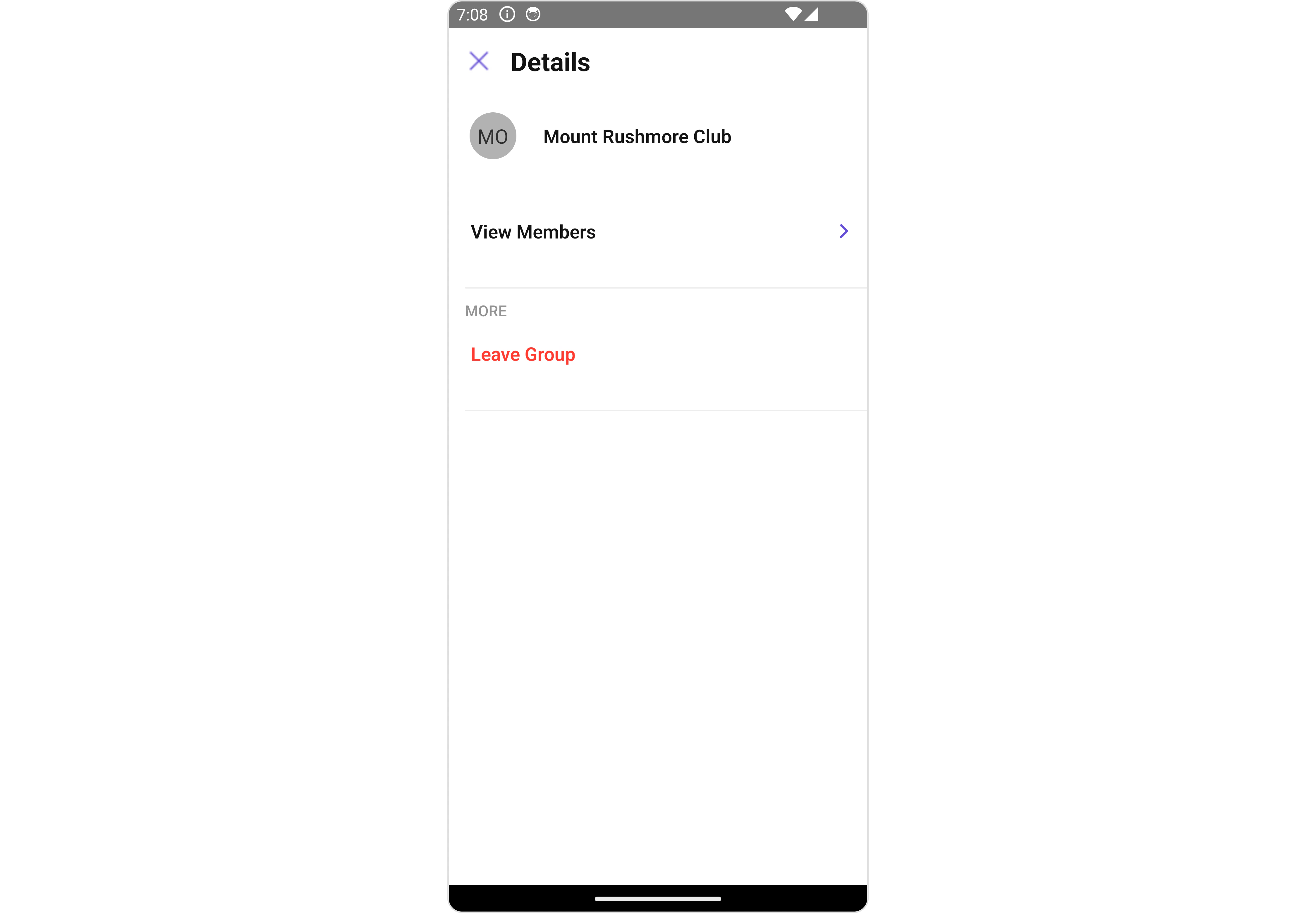
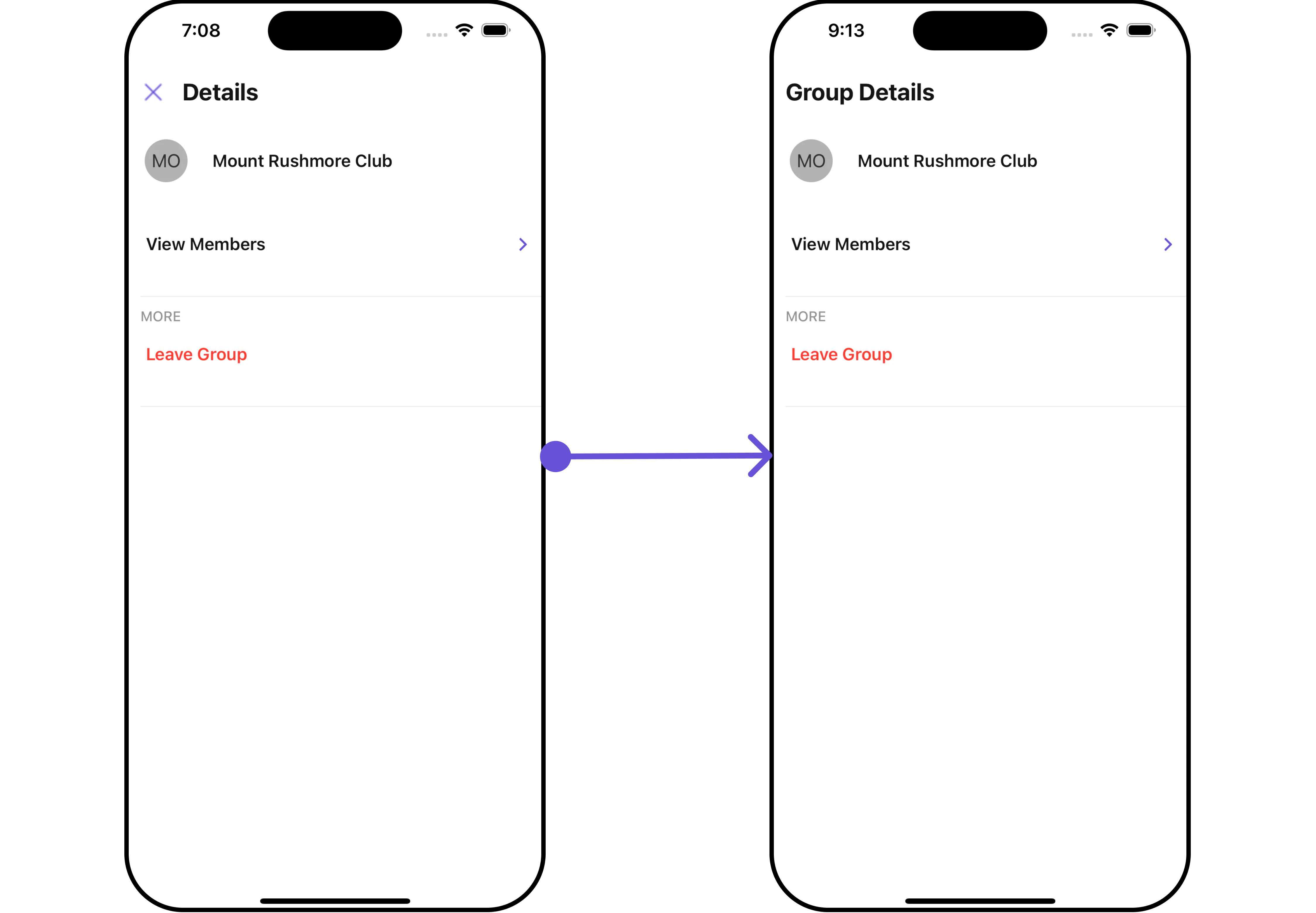
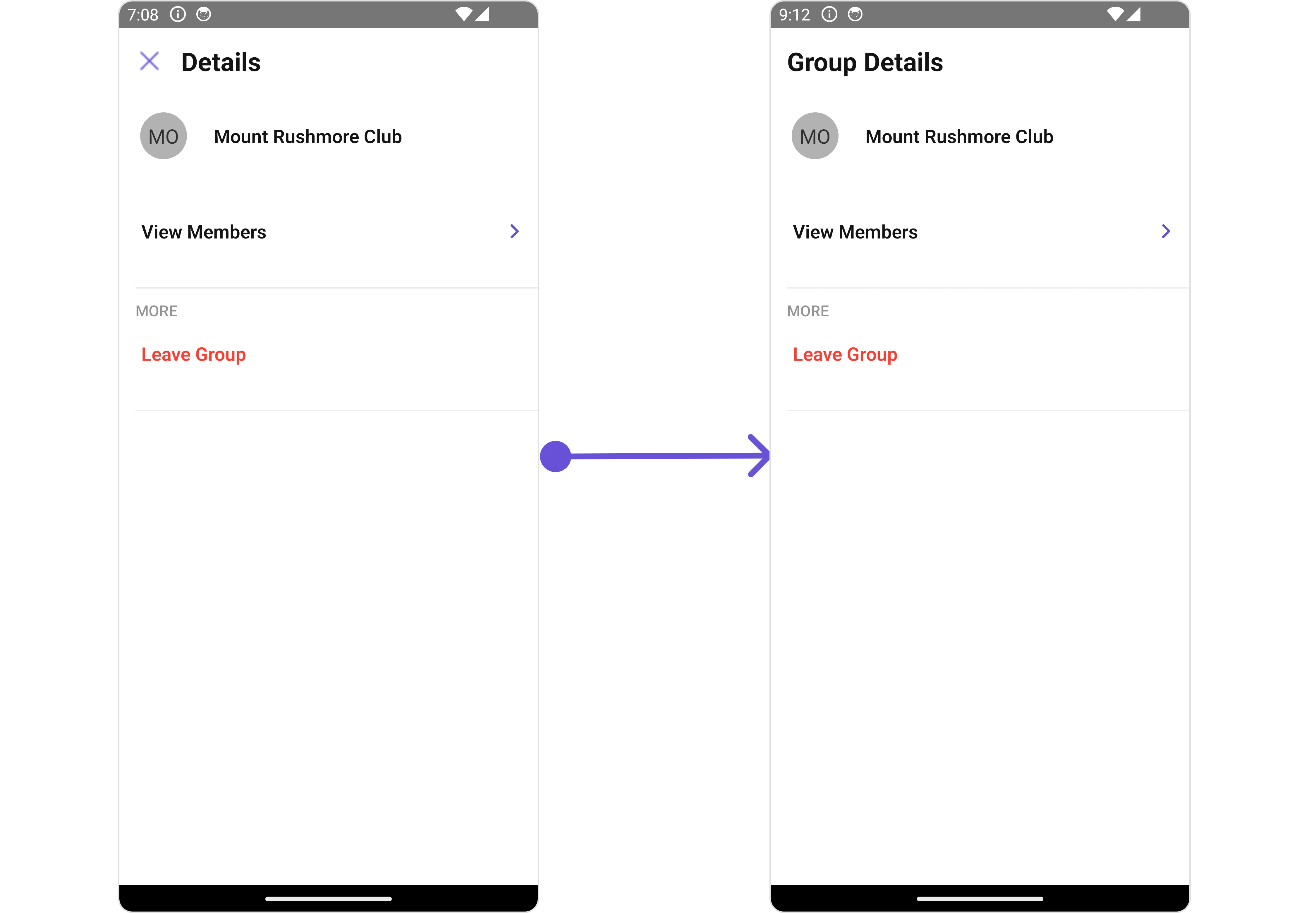
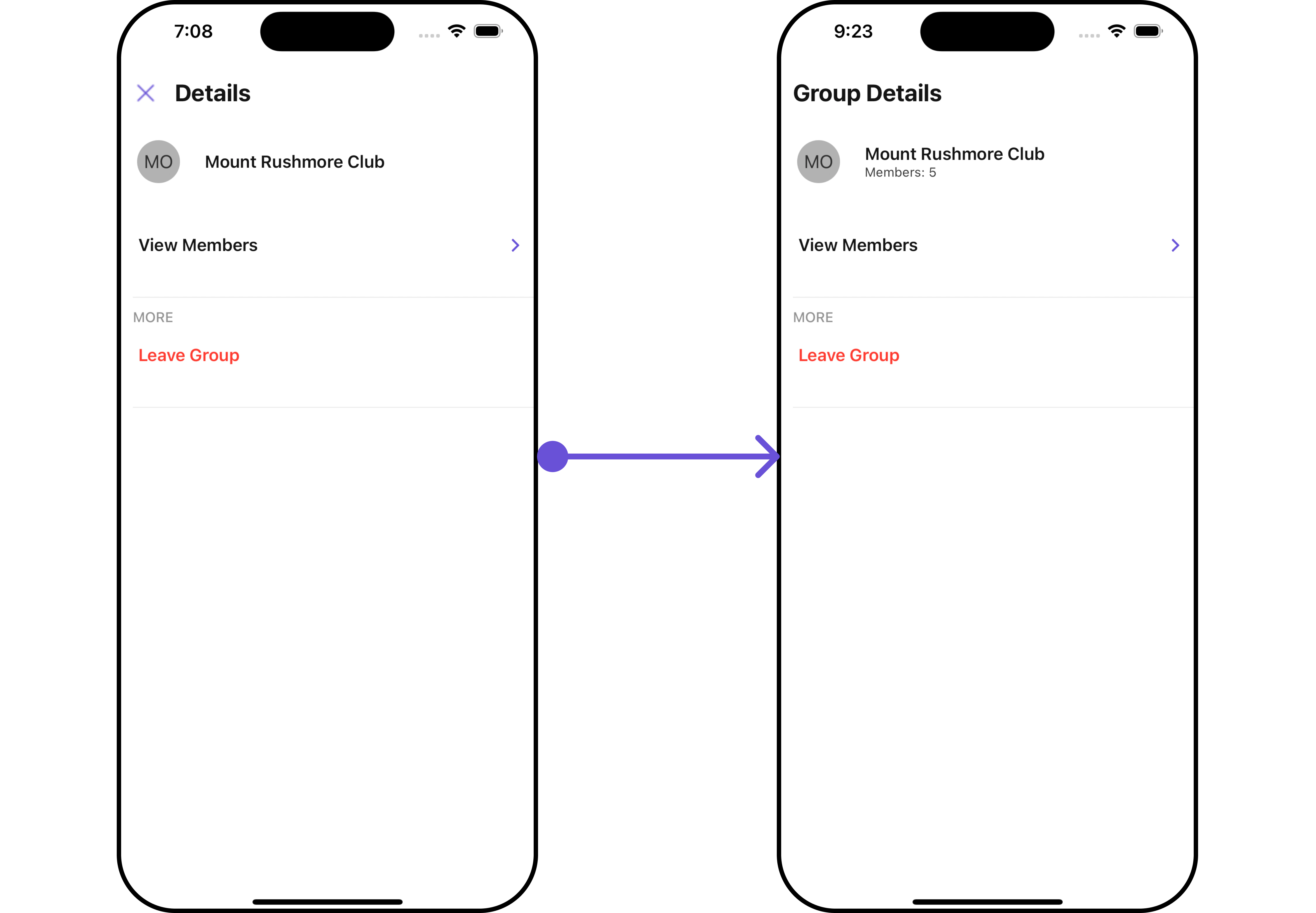
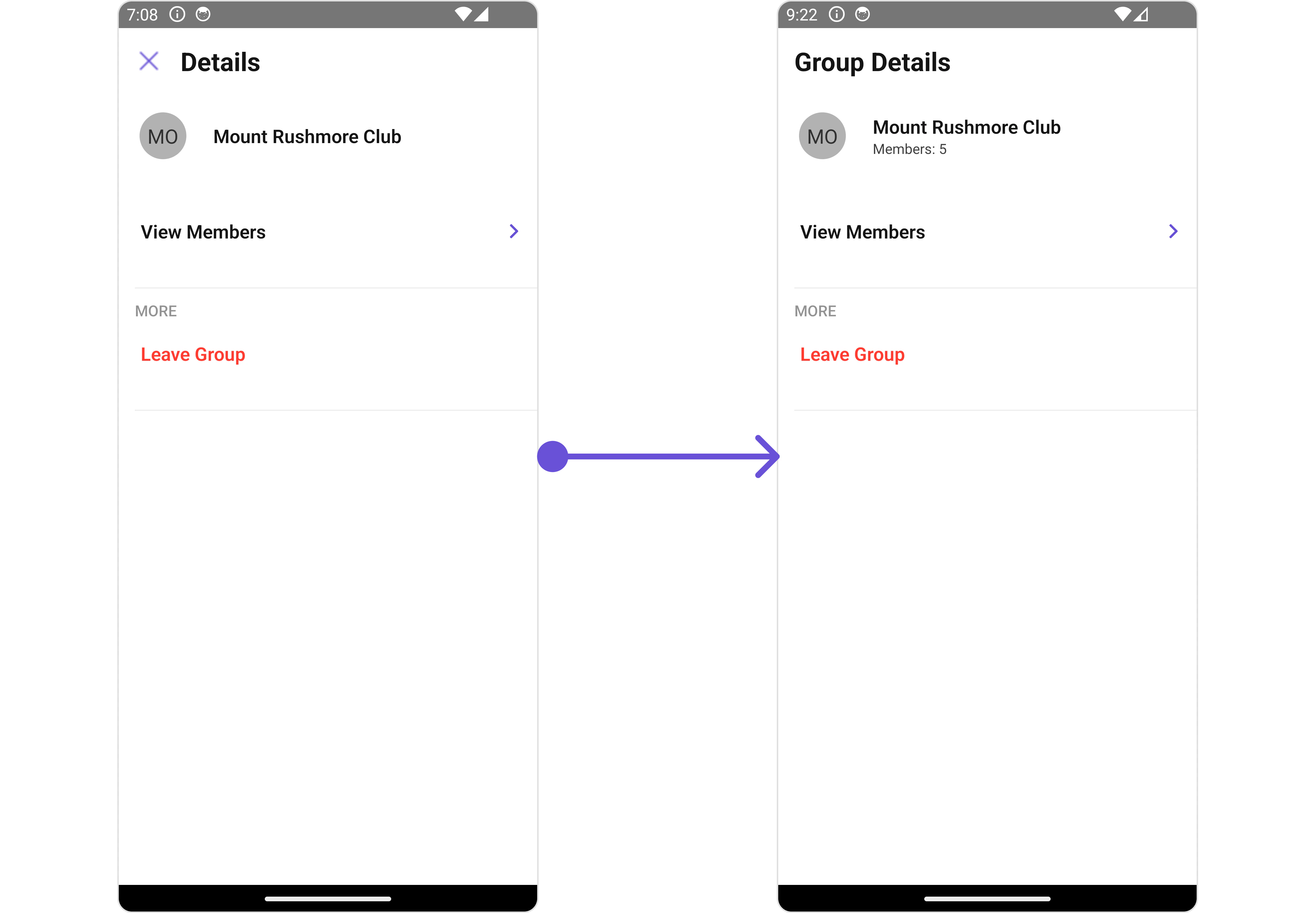
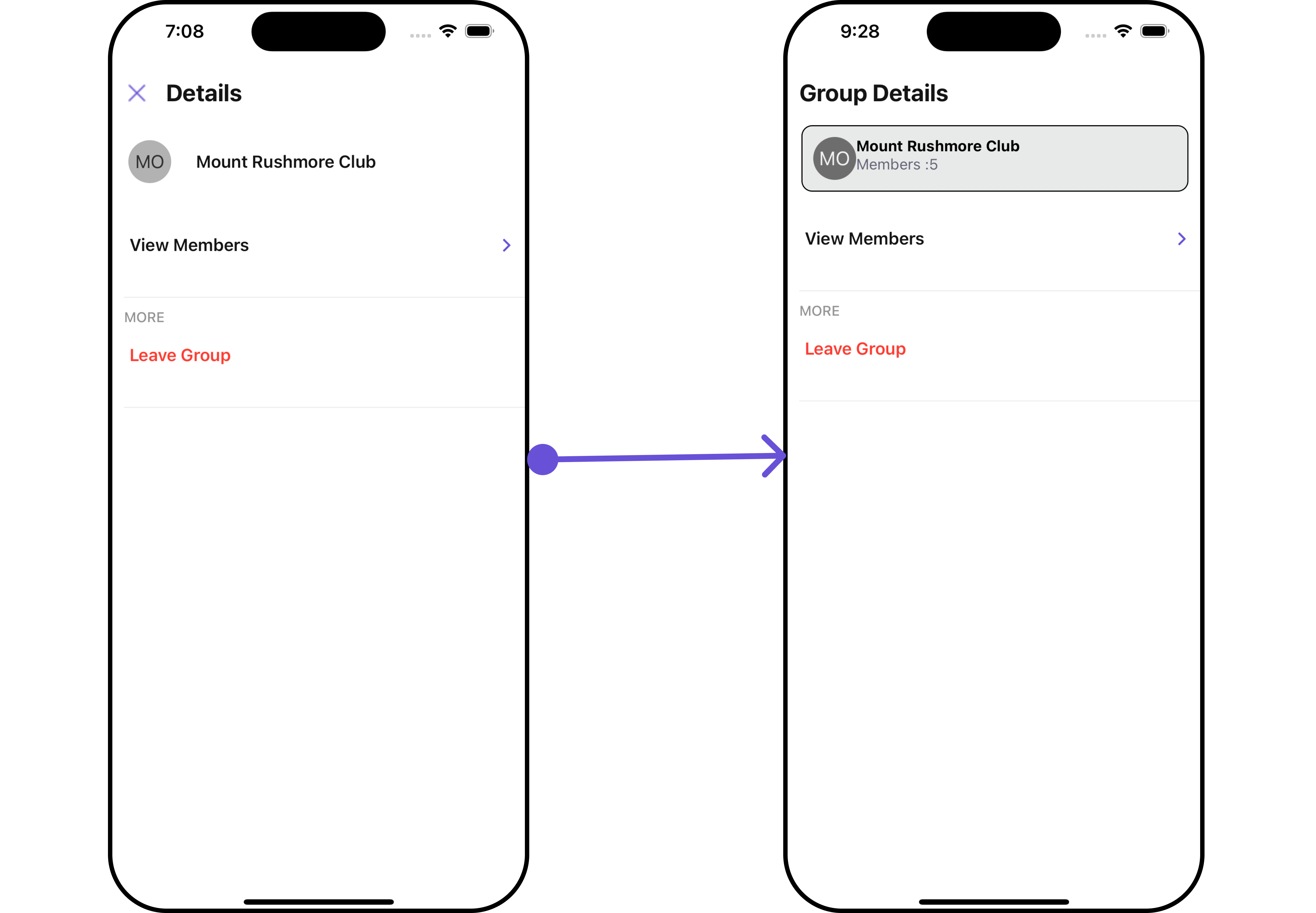
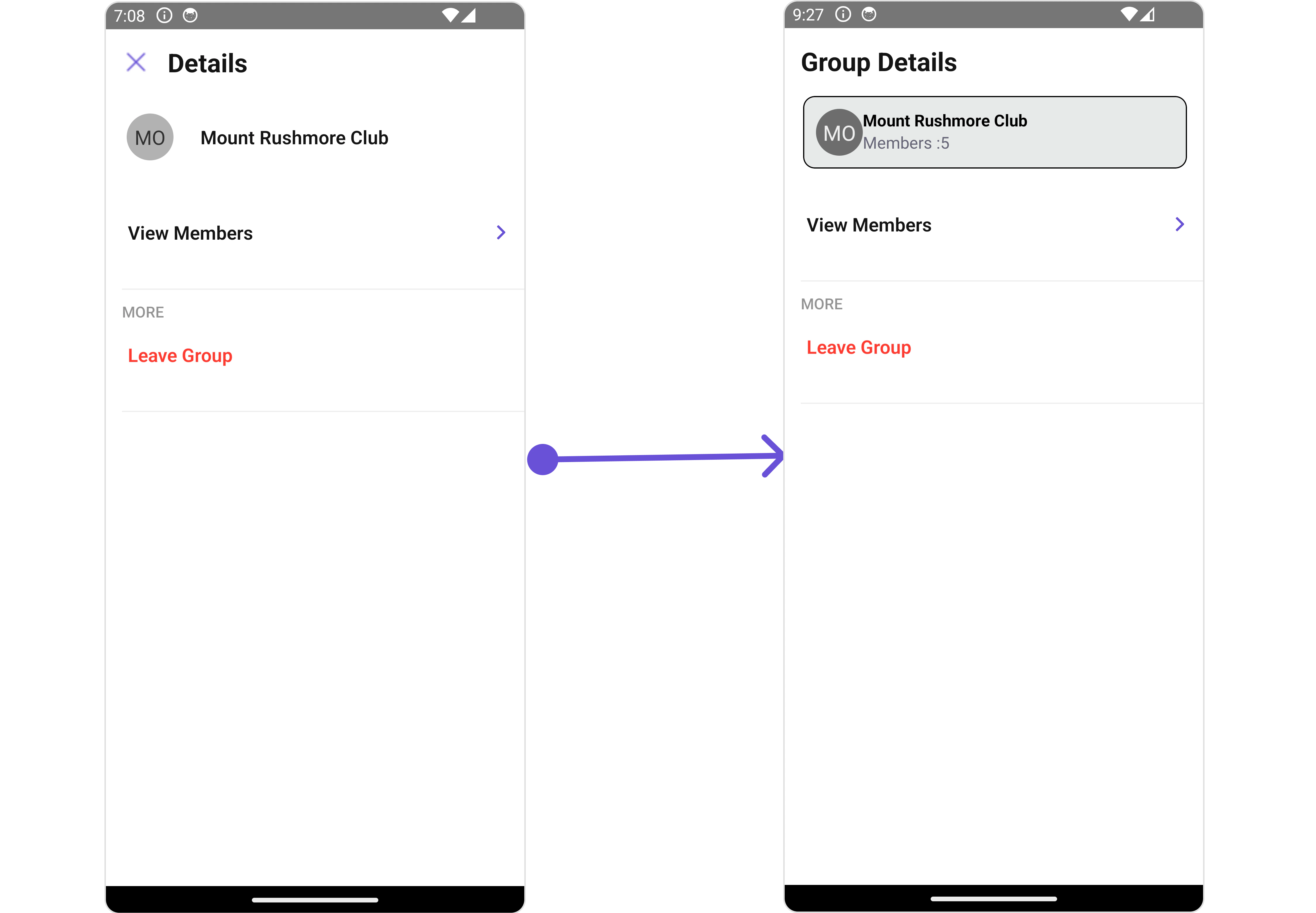
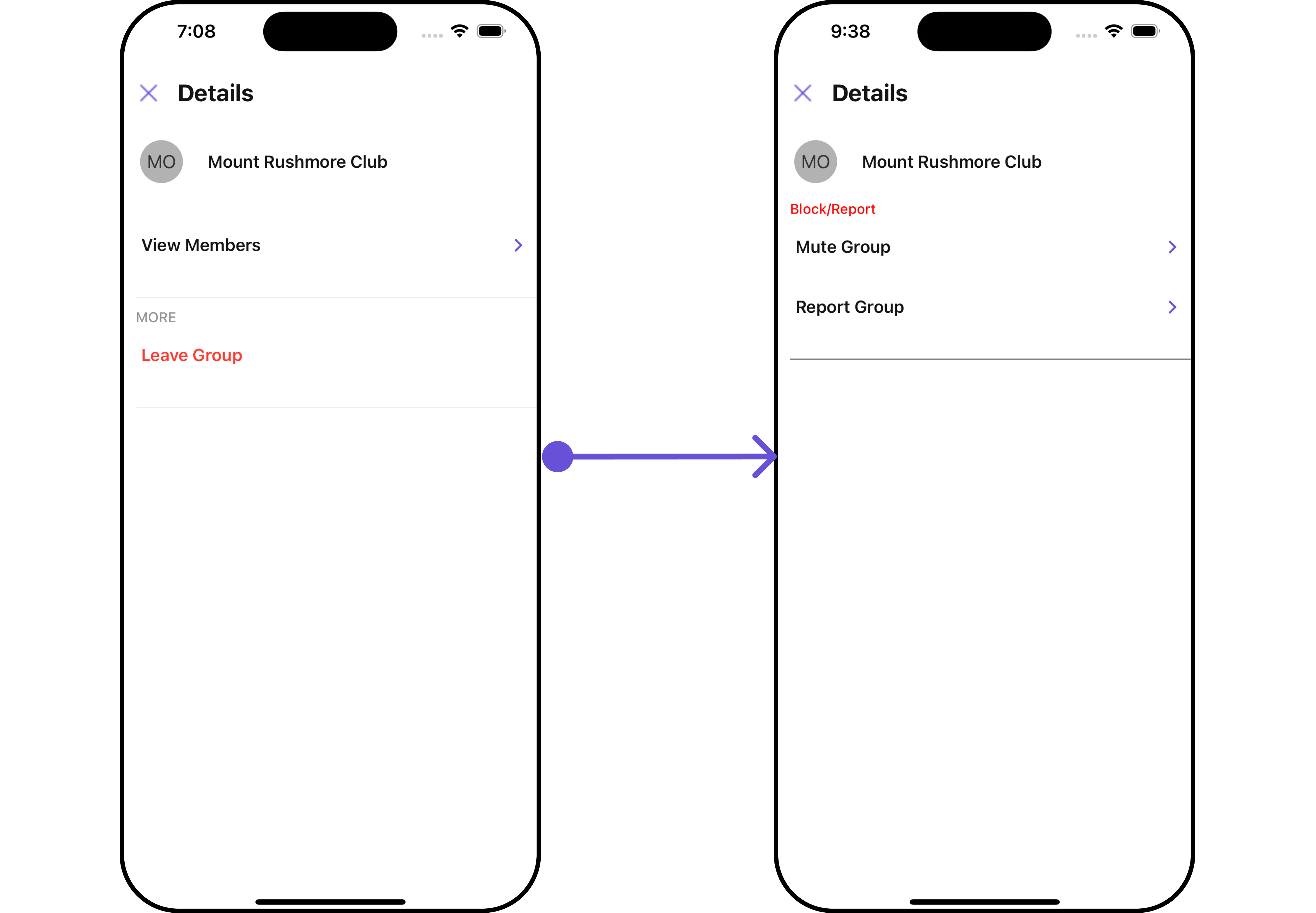
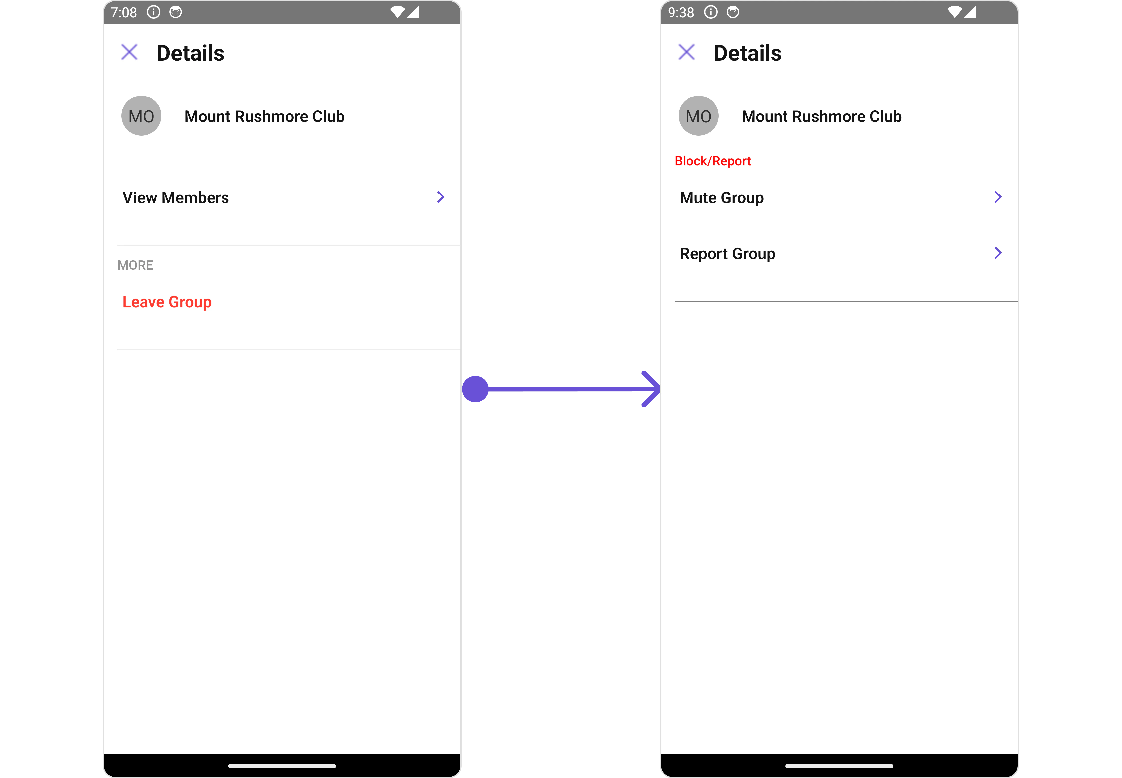
CometChatDetails is a Component that provides additional information and settings related to a specific group.
The details screen includes the following elements and functionalities:
- Group Information: It displays details about the user. This includes his/her profile picture, name, status, and other relevant information.
- Group Chat Features: It provides additional functionalities for managing the group. This includes options to add or remove participants, assign roles or permissions, and view group-related information.
- Group Actions: This offers actions related to the group, such as leaving the group, or deleting the group.
- iOS
- Android
Usage
Integration
- App.tsx
Actions
Actions dictate how a component functions. They are divided into two types: Predefined and User-defined. You can override either type, allowing you to tailor the behavior of the component to fit your specific needs.1. onBack
TheonBack event is typically triggered when the back button is clicked and it does not carry a default action.
With the following code snippet, you can effortlessly override this default operation.
- App.tsx
2. onError
This action doesn’t change the behavior of the component but rather listens for any errors that occur in the Details component.- App.tsx
Filters
Filters allow you to customize the data displayed in a list within a Component. You can filter the list based on your specific criteria, allowing for a more customized. Filters can be applied using RequestBuilders of Chat SDK.CometChatDetails component does not have available filters.
Events
Events are emitted by aComponent. By using event you can extend existing functionality. Being global events, they can be applied in Multiple Locations and are capable of being Added or Removed.
The list of Group Related Events emitted by the Details component is as follows:
- Adding Listeners
- Removing Listeners
Customization
To fit your app’s design requirements, you can customize the appearance of the details component. We provide exposed methods that allow you to modify the experience and behavior according to your specific needs.Style
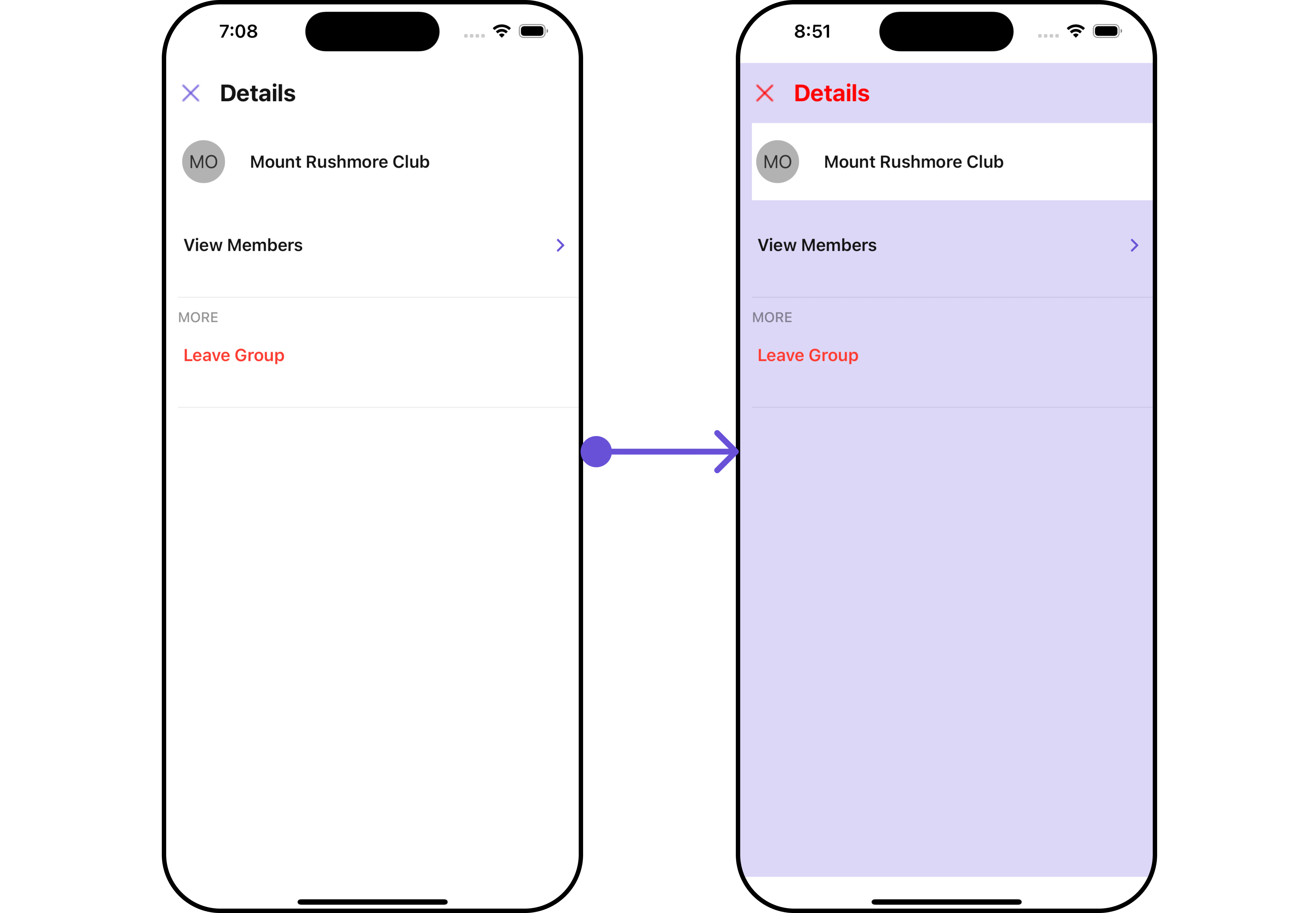
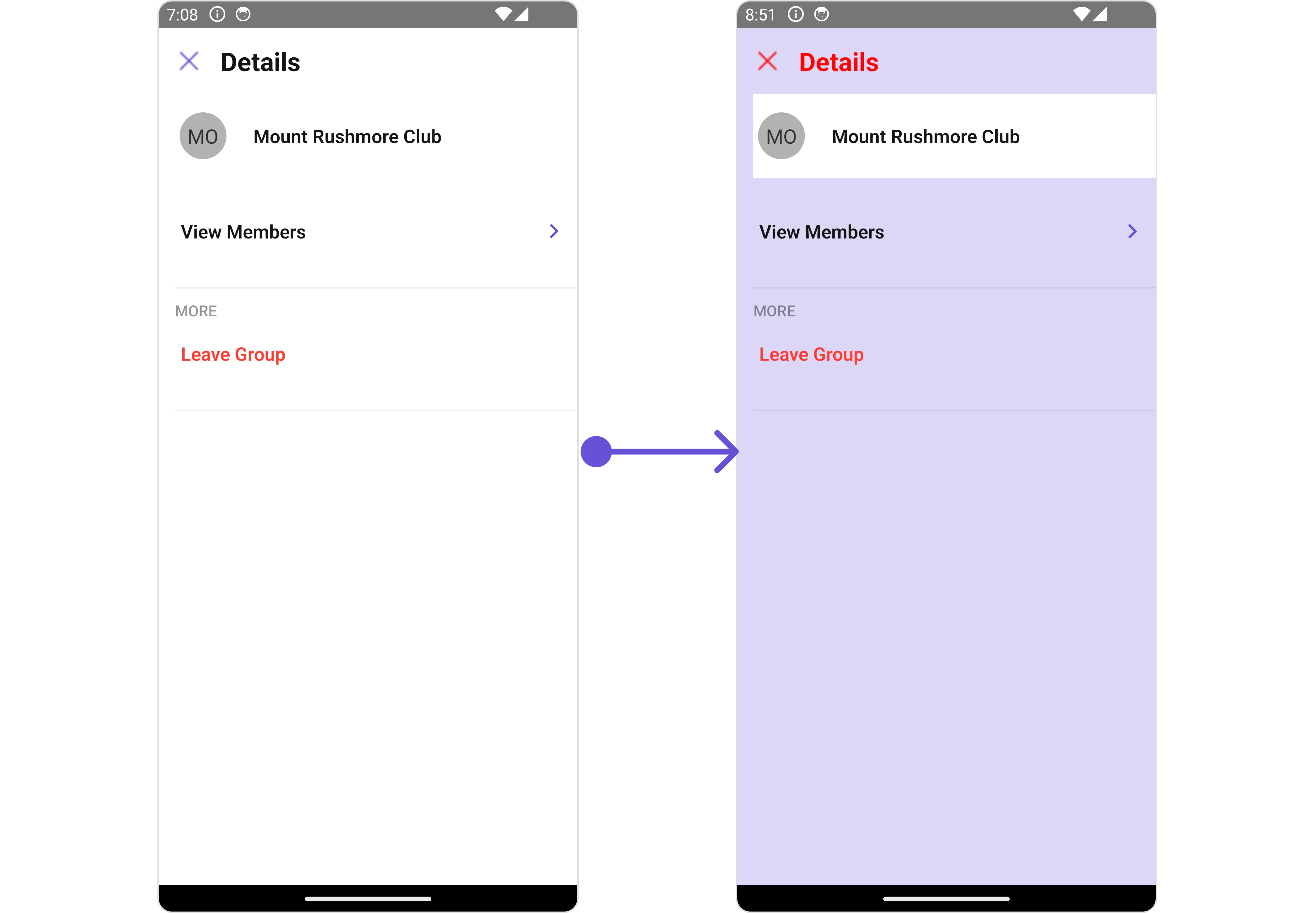
Using Style you can customize the look and feel of the component in your app, These parameters typically control elements such as the color, size, shape, and fonts used within the component.1. Details Style
You can set theDetailsStyle to the User Details Component to customize the styling.
- App.tsx
- iOS
- Android
2. StatusIndicator Style
To apply customized styles to theStatusIndicator component in the Details Component, you can use the following code snippet. For further insights on StatusIndicator Styles refer
- App.tsx
3. ListItem Style
To apply customized styles to the List Item component in the Details Component, you can use the following code snippet. For further insights on List Item Styles refer- App.tsx
4. Avatar Style
To apply customized styles to theAvatar component in the Conversations Component, you can use the following code snippet. For further insights on Avatar Styles refer
- App.tsx
Functionality
These are a set of small functional customizations that allow you to fine-tune the overall experience of the component. With these, you can change text, set custom icons, and toggle the visibility of UI elements.- App.tsx
- iOS
- Android
Advanced
For advanced-level customization, you can set custom views to the component. This lets you tailor each aspect of the component to fit your exact needs and application aesthetics. You can create and define your views, layouts, and UI elements and then incorporate those into the component.SubtitleView
Using this prop, you can assign a customSubtitleView to the Details Component.
- App.tsx
- iOS
- Android
CustomProfileView
Using this prop, you can assign aCustom ProfileView to the Details Component.
- App.tsx
- iOS
- Android
DetailsTemplate
TheCometChatDetailsTemplate offers a structure for organizing information in the CometChat details component. It serves as a blueprint, defining how user-related details are presented. This structure allows for customization and organization within the CometChat interface.
This defines the structure of template data for the details component.
DetailsOption
TheDetailsOption defines the structure for individual options within the CometChat details component, facilitating customization and functionality for user interactions.
This defines the structure of each option for a template in the details component.
Below is an example of using Custom Details templates:
- App.tsx
- iOS
- Android
Configurations
Configurations offer the ability to customize the properties of each component within a Composite Component. CometChatDetails hasAdd Members, Banned Members, Transfer Ownership and Group Members component. Hence, each of these components will have its individual `Configuration“.
Configurationsexpose properties that are available in its individual components.
Group Members
You can customize the properties of the Group Members component by making use of thegroupMembersConfiguration. You can accomplish this by employing the groupMembersConfiguration props as demonstrated below:
- App.tsx
GroupMembersConfiguration can be found under Group Members. 🛑 symbol are not accessible within the Configuration Object.
Example
Let’s say you want to change the style of the Group Member subcomponent and, in addition, you only want to hide separator and left allign the title.
You can change the title using title property and hide the separator using hideSeperator property.
- App.tsx
Add Members
You can customize the properties of the Add Members component by making use of theAddMembersConfiguration. You can accomplish this by employing the addMembersConfiguration props as demonstrated below:
- App.tsx
AddMembersConfiguration can be found under Add Members. 🛑 symbol are not accessible within the Configuration Object.
Example
Let’s say you want to change the style of the Add Members subcomponent and, in addition, you only want to show section header.
You can modify the style using the addMembersStyle property and shide the separator using hideSeparator property.
- App.tsx
Banned Members
You can customize the properties of the Banned Members component by making use of theBannedMembersConfiguration. You can accomplish this by employing the bannedMembersConfiguration props as demonstrated below:
- App.tsx
BannedMembersConfiguration can be found under Banned Members. 🛑 symbol are not accessible within the Configuration Object.
Example
Let’s say you want to change the style of the Banned Members subcomponent and, in addition, you only want to hide the search bar.
You can modify the style using the bannedMembersStyle property and hide the search bar using hideSearch property.
- App.tsx
Transfer Ownership
You can customize the properties of the Transfer Ownership component by making use of theTransferOwnershipConfiguration. You can accomplish this by employing the transferOwnershipConfiguration props as demonstrated below:
- App.tsx
TransferOwnershipConfiguration can be found under Transfer Ownership. 🛑 symbol are not accessible within the Configuration Object.
Example
Let’s say you want to change the style of the Transfer Ownership subcomponent and, in addition, you only want to disable the users presence.
You can modify the style using the transferOwnershipStyle property and disable the users presence using disableUsersPresence property.
- App.tsx