Overview
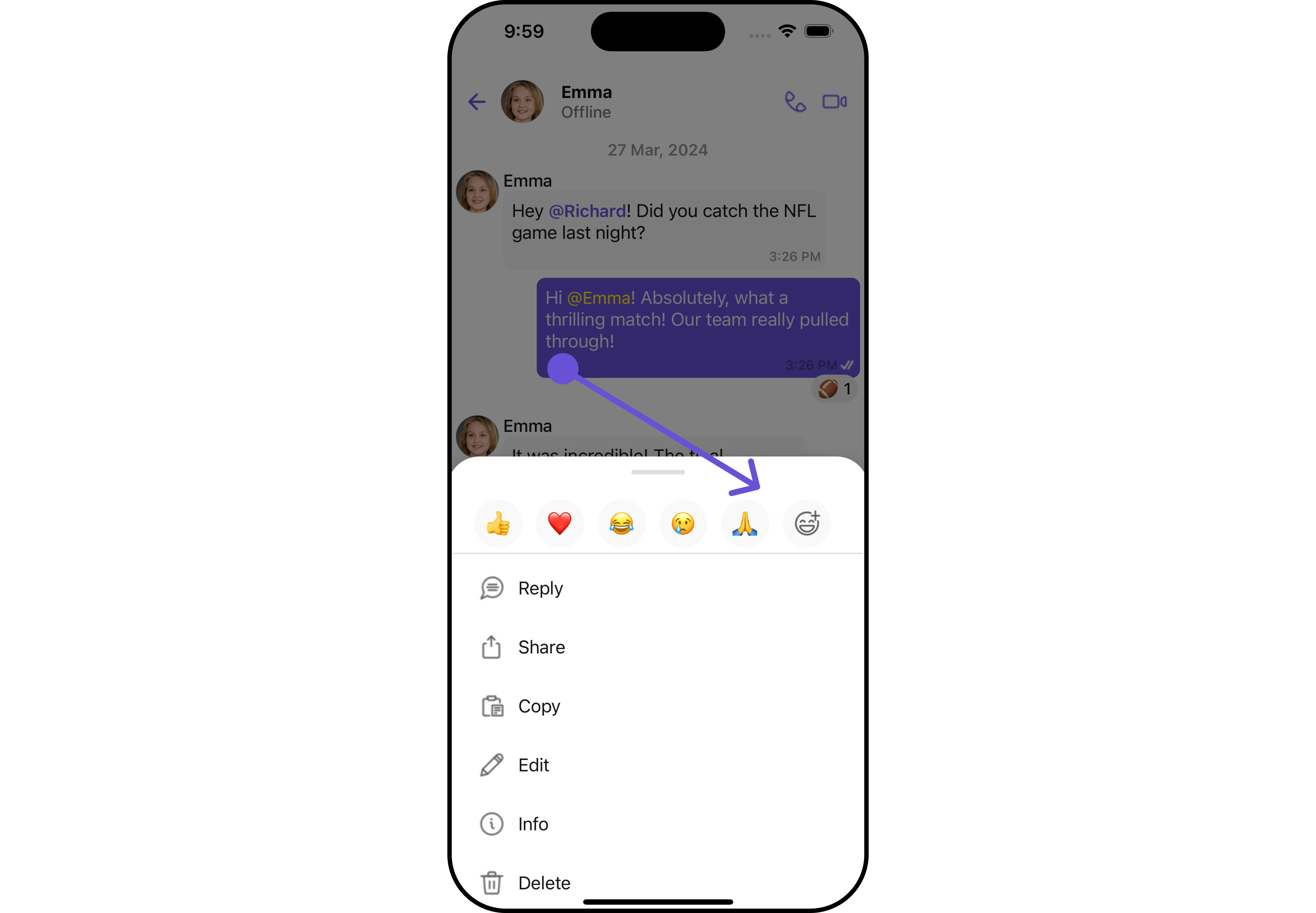
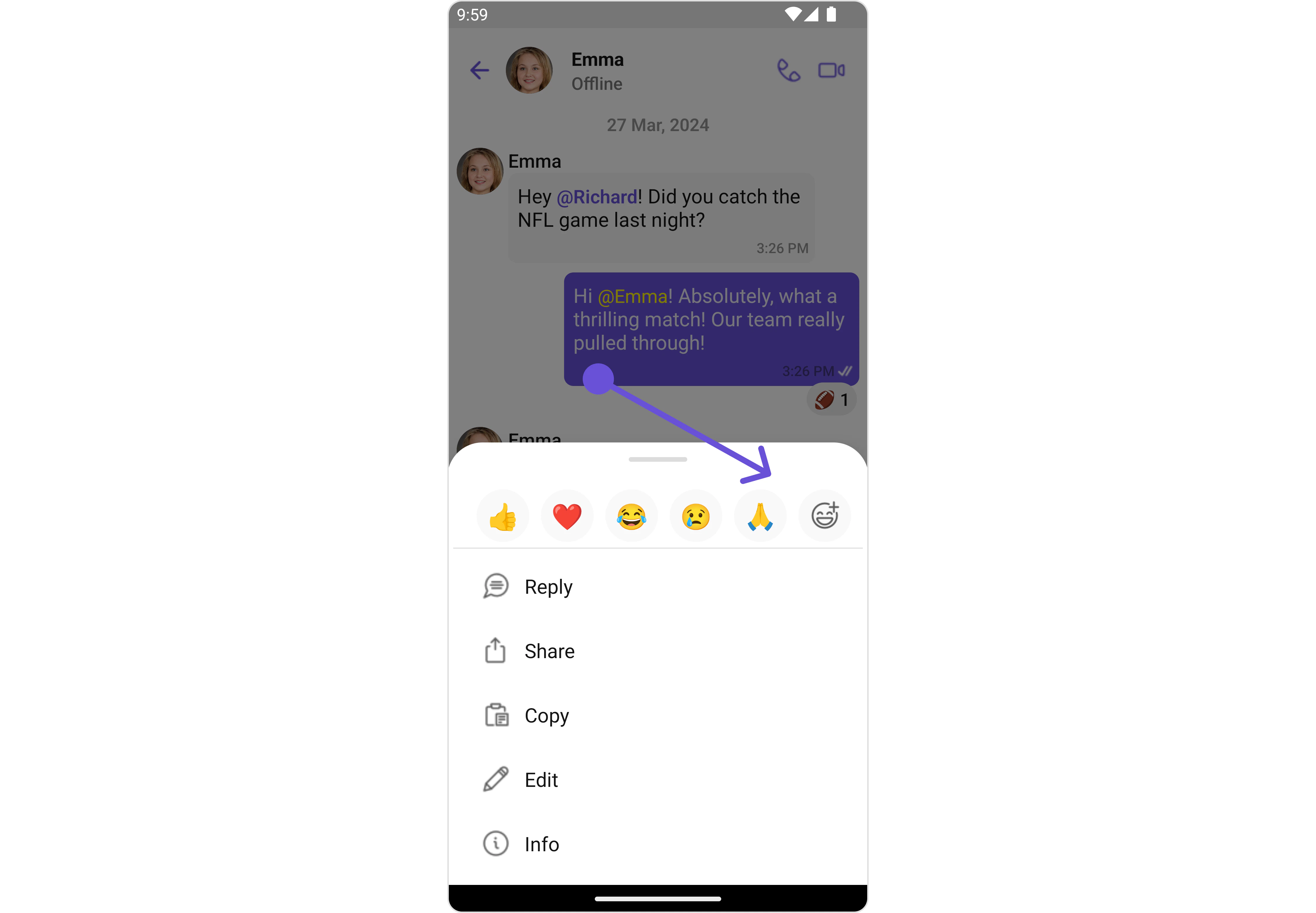
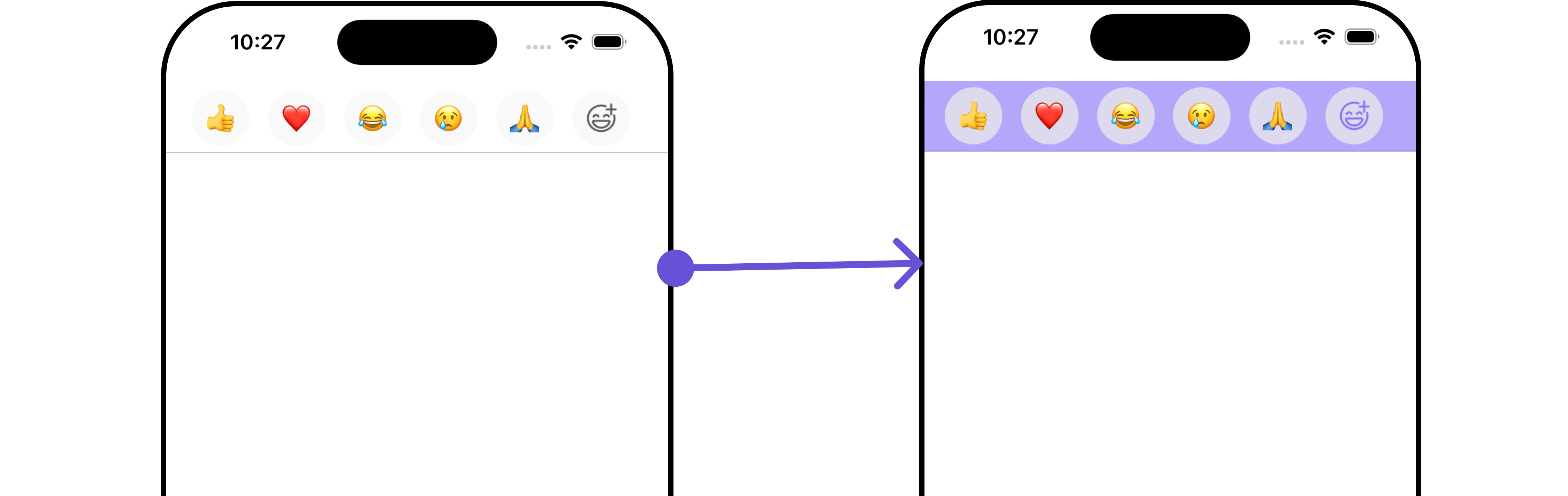
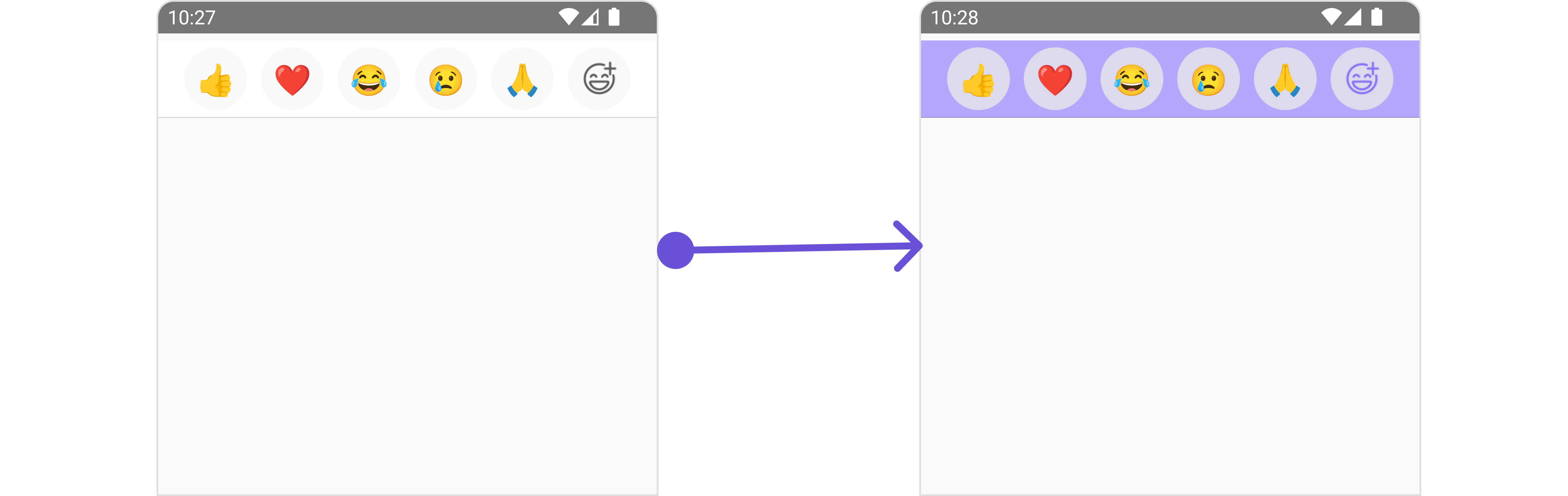
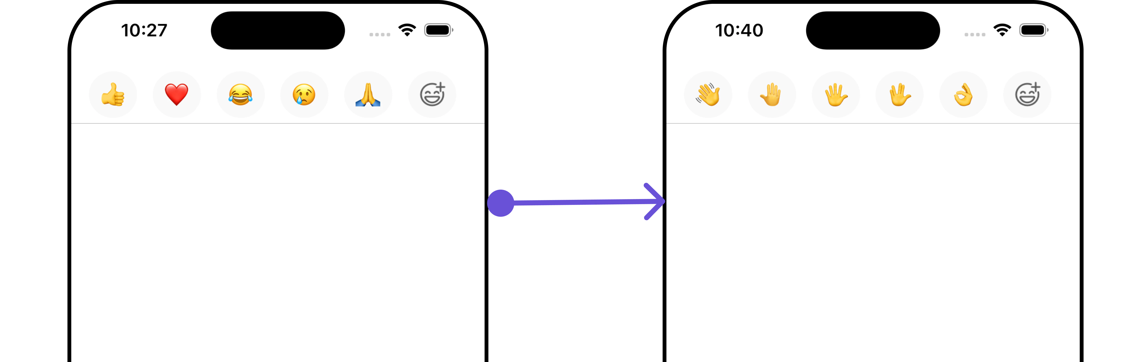
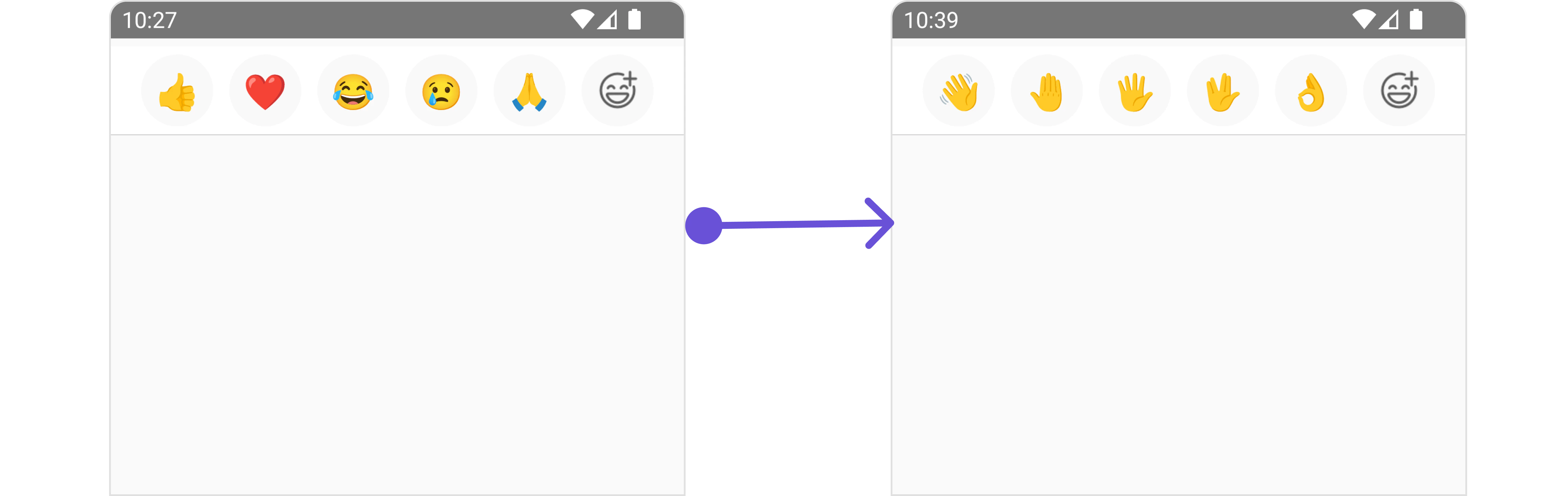
CometChatQuickReactions is a component designed to display a row of reactions that users can apply to messages. Initially, it shows favorite reactions along with a plus icon. Tapping the plus icon opens the CometChatEmojiKeyboard, providing access to a broader range of reactions. Selecting a reaction from the keyboard or the favorite reactions list automatically applies it to the respective message.
The quick reactions list can have a minimum of 1 and a maximum of 5 reactions.
This component is typically activated by long-pressing a message bubble in the message list.
- iOS
- Android
Usage
Integration
CometChatQuickReactions is a component that displays a list of favorite reactions with a plus button. The component requires a list of favorite reactions to function, which can be supplied using the quick reactions property.
- App.tsx
Actions
Actions dictate how a component functions. They are divided into two types: Predefined and User-defined. You can override either type, allowing you to tailor the behavior of the component to fit your specific needs.1. onReactionPress
TheonReactionPress action is activated when an emoji is pressed from the QuickReactions List.
- App.tsx
2. onAddReactionPress
TheonAddReactionPress action is activated when the add reaction icon is pressed.
- App.tsx
Filters
Filters empower you to customize the displayed data within a component’s list by applying specific criteria. This capability allows for a more tailored and personalized view of the content. Filters are implemented using RequestBuilders of Chat SDK. TheQuick Reactions component does not provide any exposed filtering options.
Events
Events are triggered by a component, enabling you to enhance its functionality. These events are global in scope, making them applicable across multiple areas of your application, and they can be added or removed as required. TheQuick Reactions component does not provide any available events.
Customization
For customization aligned with your app’s design, you can adjust the appearance of the Quick Reaction component using our accessible methods. These methods enable you to tailor the experience and behavior to suit your specific needs.Style
Through Style, you can customize the visual presentation of the component in your app. This includes controlling elements such as color, size, shape, and fonts to achieve the desired look and feel.1. Quick Reaction Style
QuickReactionsStyle is a class designed for customizing the visual styles of the CometChatQuickReactions view. It enables developers to easily modify colors, borders, backgrounds, and other visual attributes to align the QuickReactions component with the overall design aesthetics of their application.
This class is essential for enhancing user experience and ensuring visual consistency within the messaging interface.
- App.tsx
QuickReactionsStyle to customize the appearance.
- iOS
- Android
Functionality
These functional customizations provide ways to enhance the component’s overall experience. They allow for text modification, custom icon setting, and UI element visibility toggling.- App.tsx
- iOS
- Android
Advanced
For advanced-level customization, you can set custom views to the component. This lets you tailor each aspect of the component to fit your exact needs and application aesthetics. You can create and define your views, layouts, and UI elements and then incorporate those into the component. TheQuick Reactions component does not offer any advanced functionalities beyond this level of customization.