> ## Documentation Index
> Fetch the complete documentation index at: https://cometchat-013b37f0.mintlify.site/llms.txt
> Use this file to discover all available pages before exploring further.
# Users
## Overview
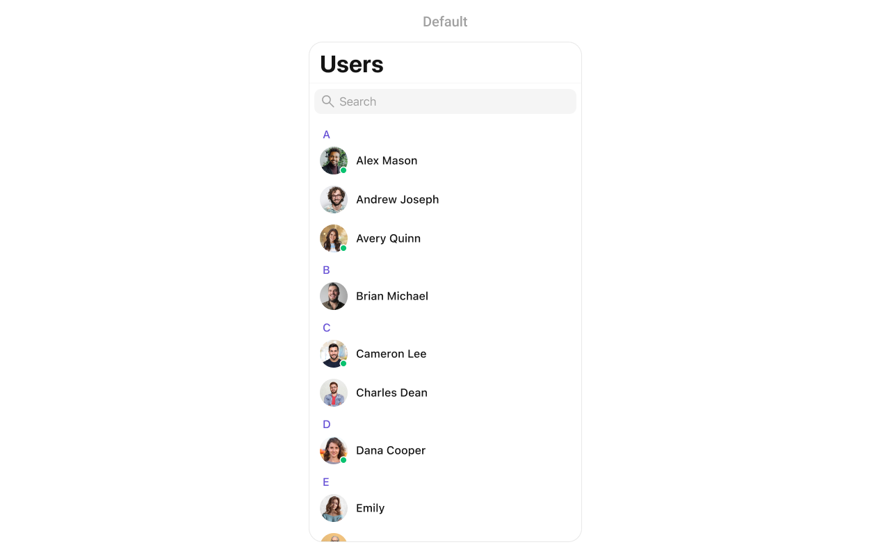
The Users is a [Component](/ui-kit/ios/components-overview#components), showcasing an accessible list of all available users. It provides an integral search functionality, allowing you to locate any specific user swiftly and easily. For each user listed, the widget displays the user's name by default, in conjunction with their avatar when available. Furthermore, it includes a status indicator, visually informing you whether a user is currently online or offline.
 The Users component is composed of the following BaseComponents:
| Components | Description |
| --------------------------------- | ----------------------------------------------------------------------------------------------------------------------- |
| [ListBase](/ui-kit/ios/list-base) | a reusable container component having title, search box, customisable background and a List View |
| [ListItem](/ui-kit/ios/list-item) | a component that renders data obtained from a User object on a Tile having a title, subtitle, leading and trailing view |
***
## Usage
### Integration
As `CometChatUsers` is a custom **view controller**, it can be launched directly by user actions such as button clicks or other interactions. It's also possible to integrate it into a **tab view controller**. `CometChatUsers` offers several parameters and methods for UI customization.
```swift theme={null}
let cometChatUsers = CometChatUsers()
let naviVC = UINavigationController(rootViewController: cometChatUsers)
self.present(naviVC, animated: true)
```
### Actions
[Actions](/ui-kit/ios/components-overview#actions) dictate how a component functions. They are divided into two types: Predefined and User-defined. You can override either type, allowing you to tailor the behavior of the component to fit your specific needs.
1. ##### set(onItemClick:)
`set(OnItemClick:)` is triggered when you click on a ListItem of the users component. This `set(OnItemClick:)` method proves beneficial when a user intends to customize the on-click behavior in CometChatUsers.
```swift theme={null}
cometChatUsers.set(onItemClick: { user, indexPath in
// Override on item click
})
```
***
2. ##### set(OnItemLongClick:)
`set(OnItemLongClick:)` is triggered when you long press on a ListItem of the users component. This `set(OnItemLongClick:)` method proves beneficial when a user intends to additional functionality on long press on list item in CometChatUsers.
```swift theme={null}
cometChatUsers.set(onItemLongClick: { user, indexPath in
// Override on item click
})
```
***
##### 3. set(onBack:)
This `set(onBack:)` method becomes valuable when a user needs to override the action triggered upon pressing the back button in CometChatUsers.
```swift theme={null}
cometChatUsers.set(onBack: {
// Override on back
})
```
***
##### 4. set(onSelection:)
The `set(onSelection:)` only gets trigger when selection mode is set to multiple of single. And this gets trigger on every selection, and returns the list of selected users.
```swift theme={null}
cometChatUsers.set(onSelection: { users in
//Handle action
})
```
***
##### 5. set(onError:)
This method proves helpful when a user needs to customize the action taken upon encountering an error in CometChatUsers.
```swift theme={null}
cometChatUsers.set(onError: { error in
// Override on error
})
```
***
##### 6. set(onEmpty:)
This `set(onEmpty:)` method is triggered when the users list is empty in CometChatUsers.
```swift theme={null}
cometChatUsers.set(onEmpty: {
// Handle empty state
})
```
***
##### 7. setOnLoad
This set(onLoad:) gets triggered when a user list is fully fetched and going to displayed on the screen, this return the list of users to get displayed on the screen.
```swift theme={null}
cometChatUsers.set(onLoad: { users in
// Handle loaded users
})
```
***
### Filters
**Filters** allow you to customize the data displayed in a list within a Component. You can filter the list based on your specific criteria, allowing for a more customized. Filters can be applied using RequestBuilders of Chat SDK.
##### 1. UserRequestBuilder
The [UserRequestBuilder](/sdk/ios/retrieve-users) enables you to filter and customize the user list based on available parameters in UserRequestBuilder. This feature allows you to create more specific and targeted queries when fetching users. The following are the parameters available in [UserRequestBuilder](/sdk/ios/retrieve-users)
| Methods | Type | Description |
| -------------------- | -------------------- | -------------------------------------------------------------------------------------- |
| **setLimit** | int | sets the number users that can be fetched in a single request, suitable for pagination |
| **setSearchKeyword** | String | used for fetching users matching the passed string |
| **hideBlockedUsers** | bool | used for fetching all those users who are not blocked by the logged in user |
| **friendsOnly** | bool | used for fetching only those users in which logged in user is a member |
| **setRoles** | \[String] | used for fetching users containing the passed tags |
| **setTags** | \[String] | used for fetching users containing the passed tags |
| **withTags** | bool | used to fetch tags data along with the list of users. |
| **setStatus** | CometChat.UserStatus | used for fetching users by their status online or offline |
| **setUIDs** | \[String] | used for fetching users containing the passed users |
**Example**
In the example below, we are applying a filter to the UserList based on Friends.
```swift theme={null}
let usersRequestBuilder = UsersRequest.UsersRequestBuilder(limit: 20).friendsOnly(true)
let usersWithMessages = CometChatUsersWithMessages(usersRequestBuilder: usersRequestBuilder)
let naviVC = UINavigationController(rootViewController: usersWithMessages)
self.present(naviVC, animated: true)
```
##### 2. SearchRequestBuilder
The SearchRequestBuilder uses [UserRequestBuilder](/sdk/ios/retrieve-users) enables you to filter and customize the search list based on available parameters in UserRequestBuilder. This feature allows you to keep uniformity between the displayed UserList and searched UserList.
**Example** In the example below, we are applying a filter to the UserList based on Search.
```swift theme={null}
let usersRequestBuilder = UsersRequest.UsersRequestBuilder(limit: 20)
.set(searchKeyword: "**")
let usersWithMessages = CometChatUsers(usersRequestBuilder: usersRequestBuilder)
let naviVC = UINavigationController(rootViewController: usersWithMessages)
self.present(naviVC, animated: true)
```
### Events
[Events](/ui-kit/ios/components-overview#events) are emitted by a `Component`. By using event you can extend existing functionality. Being global events, they can be applied in Multiple Locations and are capable of being Added or Removed.
To handle events supported by Users you have to add corresponding listeners by using `CometChatUserEvents`
| Events | Description |
| ----------------- | --------------------------------------------------------------------- |
| emitOnUserBlock | This will get triggered when the logged in user blocks another user |
| emitOnUserUnblock | This will get triggered when the logged in user unblocks another user |
```swift theme={null}
///pass the [User] object of the user which has been blocked by the logged in user
CometChatUserEvents.emitOnUserBlock(user: User)
///pass the [User] object of the user which has been unblocked by the logged in user
CometChatUserEvents.emitOnUserUnblock(user: User)
```
**Usage**
```swift Swift theme={null}
// View controller from your project where you want to listen events.
public class ViewController: UIViewController {
public override func viewDidLoad() {
super.viewDidLoad()
// Subscribing for the listener to listen events from user module
CometChatUserEvents.addListener("UNIQUE_ID", self as CometChatUserEventListener)
}
public override func viewWillDisappear(_ animated: Bool) {
// Uncubscribing for the listener to listen events from user module
CometChatUserEvents.removeListener("LISTENER_ID_USED_FOR_ADDING_THIS_LISTENER")
}
}
// Listener events from user module
extension ViewController: CometChatUserEventListener {
func onUserBlock(user: User) {
// Do Stuff
}
func onUserUnblock(user: User) {
// Do Stuff
}
}
```
## Customization
To fit your app's design requirements, you can customize the appearance of the users component. We provide exposed methods that allow you to modify the experience and behavior according to your specific needs.
### Style
Using Style you can customize the look and feel of the component in your app, These parameters typically control elements such as the color, size, shape, and fonts used within the component.
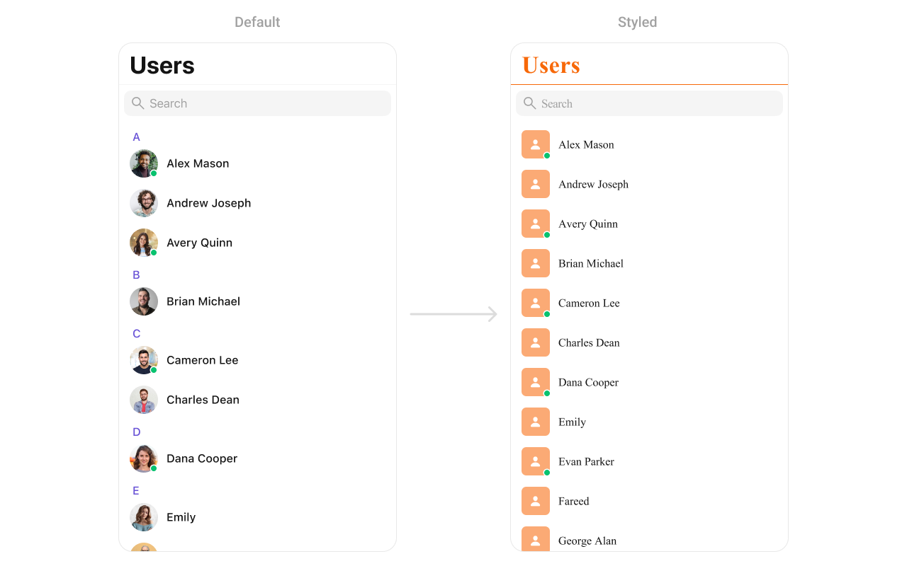
##### 1. Users Style
You can set the `UsersStyle` to the Users Component to customize the styling.
**Global level styling**
```swift theme={null}
let customAvatarStyle = AvatarStyle()
customAvatarStyle.backgroundColor = UIColor(hex: "#FBAA75")
customAvatarStyle.cornerRadius = CometChatCornerStyle(cornerRadius: 20)
CometChatUsers.style.titleColor = UIColor(hex: "#F76808")
CometChatUsers.style.titleFont = UIFont(name: "Times-New-Roman", size: 34)
CometChatUsers.avatarStyle = customAvatarStyle
```
**Instance level styling**
```swift theme={null}
let customAvatarStyle = AvatarStyle()
customAvatarStyle.backgroundColor = UIColor(hex: "#FBAA75")
customAvatarStyle.cornerRadius = CometChatCornerStyle(cornerRadius: 20)
let userStyle = UsersStyle()
userStyle.titleColor = UIColor(hex: "#F76808")
userStyle.titleFont = UIFont(name: "Times-New-Roman", size: 34)
let customUser = CometChatUsers()
customUser.style = userStyle
customUser.avatarStyle = customAvatarStyle
```
The Users component is composed of the following BaseComponents:
| Components | Description |
| --------------------------------- | ----------------------------------------------------------------------------------------------------------------------- |
| [ListBase](/ui-kit/ios/list-base) | a reusable container component having title, search box, customisable background and a List View |
| [ListItem](/ui-kit/ios/list-item) | a component that renders data obtained from a User object on a Tile having a title, subtitle, leading and trailing view |
***
## Usage
### Integration
As `CometChatUsers` is a custom **view controller**, it can be launched directly by user actions such as button clicks or other interactions. It's also possible to integrate it into a **tab view controller**. `CometChatUsers` offers several parameters and methods for UI customization.
```swift theme={null}
let cometChatUsers = CometChatUsers()
let naviVC = UINavigationController(rootViewController: cometChatUsers)
self.present(naviVC, animated: true)
```
### Actions
[Actions](/ui-kit/ios/components-overview#actions) dictate how a component functions. They are divided into two types: Predefined and User-defined. You can override either type, allowing you to tailor the behavior of the component to fit your specific needs.
1. ##### set(onItemClick:)
`set(OnItemClick:)` is triggered when you click on a ListItem of the users component. This `set(OnItemClick:)` method proves beneficial when a user intends to customize the on-click behavior in CometChatUsers.
```swift theme={null}
cometChatUsers.set(onItemClick: { user, indexPath in
// Override on item click
})
```
***
2. ##### set(OnItemLongClick:)
`set(OnItemLongClick:)` is triggered when you long press on a ListItem of the users component. This `set(OnItemLongClick:)` method proves beneficial when a user intends to additional functionality on long press on list item in CometChatUsers.
```swift theme={null}
cometChatUsers.set(onItemLongClick: { user, indexPath in
// Override on item click
})
```
***
##### 3. set(onBack:)
This `set(onBack:)` method becomes valuable when a user needs to override the action triggered upon pressing the back button in CometChatUsers.
```swift theme={null}
cometChatUsers.set(onBack: {
// Override on back
})
```
***
##### 4. set(onSelection:)
The `set(onSelection:)` only gets trigger when selection mode is set to multiple of single. And this gets trigger on every selection, and returns the list of selected users.
```swift theme={null}
cometChatUsers.set(onSelection: { users in
//Handle action
})
```
***
##### 5. set(onError:)
This method proves helpful when a user needs to customize the action taken upon encountering an error in CometChatUsers.
```swift theme={null}
cometChatUsers.set(onError: { error in
// Override on error
})
```
***
##### 6. set(onEmpty:)
This `set(onEmpty:)` method is triggered when the users list is empty in CometChatUsers.
```swift theme={null}
cometChatUsers.set(onEmpty: {
// Handle empty state
})
```
***
##### 7. setOnLoad
This set(onLoad:) gets triggered when a user list is fully fetched and going to displayed on the screen, this return the list of users to get displayed on the screen.
```swift theme={null}
cometChatUsers.set(onLoad: { users in
// Handle loaded users
})
```
***
### Filters
**Filters** allow you to customize the data displayed in a list within a Component. You can filter the list based on your specific criteria, allowing for a more customized. Filters can be applied using RequestBuilders of Chat SDK.
##### 1. UserRequestBuilder
The [UserRequestBuilder](/sdk/ios/retrieve-users) enables you to filter and customize the user list based on available parameters in UserRequestBuilder. This feature allows you to create more specific and targeted queries when fetching users. The following are the parameters available in [UserRequestBuilder](/sdk/ios/retrieve-users)
| Methods | Type | Description |
| -------------------- | -------------------- | -------------------------------------------------------------------------------------- |
| **setLimit** | int | sets the number users that can be fetched in a single request, suitable for pagination |
| **setSearchKeyword** | String | used for fetching users matching the passed string |
| **hideBlockedUsers** | bool | used for fetching all those users who are not blocked by the logged in user |
| **friendsOnly** | bool | used for fetching only those users in which logged in user is a member |
| **setRoles** | \[String] | used for fetching users containing the passed tags |
| **setTags** | \[String] | used for fetching users containing the passed tags |
| **withTags** | bool | used to fetch tags data along with the list of users. |
| **setStatus** | CometChat.UserStatus | used for fetching users by their status online or offline |
| **setUIDs** | \[String] | used for fetching users containing the passed users |
**Example**
In the example below, we are applying a filter to the UserList based on Friends.
```swift theme={null}
let usersRequestBuilder = UsersRequest.UsersRequestBuilder(limit: 20).friendsOnly(true)
let usersWithMessages = CometChatUsersWithMessages(usersRequestBuilder: usersRequestBuilder)
let naviVC = UINavigationController(rootViewController: usersWithMessages)
self.present(naviVC, animated: true)
```
##### 2. SearchRequestBuilder
The SearchRequestBuilder uses [UserRequestBuilder](/sdk/ios/retrieve-users) enables you to filter and customize the search list based on available parameters in UserRequestBuilder. This feature allows you to keep uniformity between the displayed UserList and searched UserList.
**Example** In the example below, we are applying a filter to the UserList based on Search.
```swift theme={null}
let usersRequestBuilder = UsersRequest.UsersRequestBuilder(limit: 20)
.set(searchKeyword: "**")
let usersWithMessages = CometChatUsers(usersRequestBuilder: usersRequestBuilder)
let naviVC = UINavigationController(rootViewController: usersWithMessages)
self.present(naviVC, animated: true)
```
### Events
[Events](/ui-kit/ios/components-overview#events) are emitted by a `Component`. By using event you can extend existing functionality. Being global events, they can be applied in Multiple Locations and are capable of being Added or Removed.
To handle events supported by Users you have to add corresponding listeners by using `CometChatUserEvents`
| Events | Description |
| ----------------- | --------------------------------------------------------------------- |
| emitOnUserBlock | This will get triggered when the logged in user blocks another user |
| emitOnUserUnblock | This will get triggered when the logged in user unblocks another user |
```swift theme={null}
///pass the [User] object of the user which has been blocked by the logged in user
CometChatUserEvents.emitOnUserBlock(user: User)
///pass the [User] object of the user which has been unblocked by the logged in user
CometChatUserEvents.emitOnUserUnblock(user: User)
```
**Usage**
```swift Swift theme={null}
// View controller from your project where you want to listen events.
public class ViewController: UIViewController {
public override func viewDidLoad() {
super.viewDidLoad()
// Subscribing for the listener to listen events from user module
CometChatUserEvents.addListener("UNIQUE_ID", self as CometChatUserEventListener)
}
public override func viewWillDisappear(_ animated: Bool) {
// Uncubscribing for the listener to listen events from user module
CometChatUserEvents.removeListener("LISTENER_ID_USED_FOR_ADDING_THIS_LISTENER")
}
}
// Listener events from user module
extension ViewController: CometChatUserEventListener {
func onUserBlock(user: User) {
// Do Stuff
}
func onUserUnblock(user: User) {
// Do Stuff
}
}
```
## Customization
To fit your app's design requirements, you can customize the appearance of the users component. We provide exposed methods that allow you to modify the experience and behavior according to your specific needs.
### Style
Using Style you can customize the look and feel of the component in your app, These parameters typically control elements such as the color, size, shape, and fonts used within the component.
##### 1. Users Style
You can set the `UsersStyle` to the Users Component to customize the styling.
**Global level styling**
```swift theme={null}
let customAvatarStyle = AvatarStyle()
customAvatarStyle.backgroundColor = UIColor(hex: "#FBAA75")
customAvatarStyle.cornerRadius = CometChatCornerStyle(cornerRadius: 20)
CometChatUsers.style.titleColor = UIColor(hex: "#F76808")
CometChatUsers.style.titleFont = UIFont(name: "Times-New-Roman", size: 34)
CometChatUsers.avatarStyle = customAvatarStyle
```
**Instance level styling**
```swift theme={null}
let customAvatarStyle = AvatarStyle()
customAvatarStyle.backgroundColor = UIColor(hex: "#FBAA75")
customAvatarStyle.cornerRadius = CometChatCornerStyle(cornerRadius: 20)
let userStyle = UsersStyle()
userStyle.titleColor = UIColor(hex: "#F76808")
userStyle.titleFont = UIFont(name: "Times-New-Roman", size: 34)
let customUser = CometChatUsers()
customUser.style = userStyle
customUser.avatarStyle = customAvatarStyle
```
 List of properties exposed by MessageListStyle
| **Property** | **Description** | **Code** |
| ----------------------------------- | ----------------------------------------------------------------- | ---------------------------------------------------------------------------------------- |
| **List Item Selected Image** | Image shown when a list item is selected. | `CometChatUsers.style.listItemSelectedImage = UIImage()` |
| **List Item Deselected Image** | Image shown when a list item is deselected. | `CometChatUsers.style.listItemDeSelectedImage = UIImage()` |
| **Search Icon Tint Color** | Tint color for the search icon in the search bar. | `CometChatUsers.style.searchIconTintColor = UIColor()` |
| **Search Bar Style** | Style of the search bar (e.g., default, prominent). | `CometChatUsers.style.searchBarStyle = .default` |
| **Search Tint Color** | Tint color for the search bar elements. | `CometChatUsers.style.searchTintColor = UIColor?` |
| **Search Bar Tint Color** | Background color for the search bar (excluding text input). | `CometChatUsers.style.searchBarTintColor = UIColor?` |
| **Placeholder Text Color** | Color of the placeholder text in the search bar. | `CometChatUsers.style.searchBarPlaceholderTextColor = UIColor?` |
| **Placeholder Text Font** | Font of the placeholder text in the search bar. | `CometChatUsers.style.searchBarPlaceholderTextFont = UIFont?` |
| **Search Bar Text Color** | Color of the entered text in the search bar. | `CometChatUsers.style.searchBarTextColor = UIColor?` |
| **Search Bar Text Font** | Font of the entered text in the search bar. | `CometChatUsers.style.searchBarTextFont = UIFont?` |
| **Search Bar Background Color** | Background color of the search bar’s text input area. | `CometChatUsers.style.searchBarBackgroundColor = UIColor?` |
| **Cancel Icon Tint Color** | Tint color for the cancel button in the search bar. | `CometChatUsers.style.searchBarCancelIconTintColor = UIColor?` |
| **Cross Icon Tint Color** | Tint color for the clear (cross) button in the search bar. | `CometChatUsers.style.searchBarCrossIconTintColor = UIColor?` |
| **Background Color** | Background color for the entire screen or view. | `.backgroundColor = CometChatTheme.backgroundColor01` |
| **Border Width** | Border width for the search bar or container. | `CometChatUsers.style.borderWidth = 0` |
| **Border Color** | Color of the border, default is clear. | `CometChatUsers.style.borderColor = .clear` |
| **Corner Radius** | Corner radius for search bar or other elements. | `CometChatUsers.style.cornerRadius = CometChatCornerStyle.init(cornerRadius: 0)` |
| **Title Text Color** | Text color for title elements within the list or navigation bar. | `CometChatUsers.style.titleColor = CometChatTheme.textColorPrimary` |
| **Title Font** | Font for title text. | `CometChatUsers.style.titleFont = CometChatTypography.Heading4.medium` |
| **Large Title Text Color** | Text color for large titles. | `CometChatUsers.style.largeTitleColor = CometChatTheme.textColorPrimary` |
| **Large Title Font** | Font for large titles. | `CometChatUsers.style.largeTitleFont = UIFont?` |
| **Navigation Bar Tint Color** | Tint color for the navigation bar background. | `CometChatUsers.style.navigationBarTintColor = CometChatTheme.backgroundColor01` |
| **Navigation Bar Items Tint Color** | Tint color for navigation bar items (buttons, icons). | `CometChatUsers.style.navigationBarItemsTintColor = CometChatTheme.iconColorHighlight` |
| **Error Title Font** | Font for the error title displayed in UI. | `CometChatUsers.style.errorTitleTextFont = CometChatTypography.Heading3.bold` |
| **Error Title Text Color** | Text color for the error title. | `CometChatUsers.style.errorTitleTextColor = CometChatTheme.textColorPrimary` |
| **Error Subtitle Font** | Font for the subtitle of error messages. | `CometChatUsers.style.errorSubTitleFont = CometChatTypography.Body.regular` |
| **Error Subtitle Text Color** | Text color for the subtitle of error messages. | `CometChatUsers.style.errorSubTitleTextColor = CometChatTheme.textColorSecondary` |
| **Retry Button Text Color** | Text color for the retry button in error states. | `CometChatUsers.style.retryButtonTextColor = CometChatTheme.buttonTextColor` |
| **Retry Button Text Font** | Font for the retry button text. | `CometChatUsers.style.retryButtonTextFont = CometChatTypography.Button.medium` |
| **Retry Button Background Color** | Background color for the retry button. | `CometChatUsers.style.retryButtonBackgroundColor = CometChatTheme.primaryColor` |
| **Retry Button Border Color** | Border color for the retry button. | `CometChatUsers.style.retryButtonBorderColor = .clear` |
| **Retry Button Border Width** | Border width for the retry button. | `CometChatUsers.style.retryButtonBorderWidth = 0` |
| **Retry Button Corner Radius** | Corner radius for the retry button. | `CometChatUsers.style.retryButtonCornerRadius = CometChatCornerStyle?` |
| **Empty State Title Font** | Font for the empty state title (when no users/items are present). | `CometChatUsers.style.emptyTitleTextFont = CometChatTypography.Heading3.bold` |
| **Empty State Title Color** | Text color for the empty state title. | `CometChatUsers.style.emptyTitleTextColor = CometChatTheme.textColorPrimary` |
| **Empty Subtitle Font** | Font for the subtitle in the empty state. | `CometChatUsers.style.emptySubTitleFont = CometChatTypography.Body.regular` |
| **Empty Subtitle Text Color** | Text color for the subtitle in the empty state. | `CometChatUsers.style.emptySubTitleTextColor = CometChatTheme.textColorSecondary` |
| **Table View Separator Color** | Color for the table view separator. | `CometChatUsers.style.tableViewSeparator = .clear` |
| **List Item Title Text Color** | Text color for list item titles. | `CometChatUsers.style.listItemTitleTextColor = CometChatTheme.textColorPrimary` |
| **List Item Title Font** | Font for list item titles. | `CometChatUsers.style.listItemTitleFont = CometChatTypography.Heading4.medium` |
| **List Item Subtitle Text Color** | Text color for list item subtitles. | `CometChatUsers.style.listItemSubTitleTextColor = CometChatTheme.textColorSecondary` |
| **List Item Subtitle Font** | Font for list item subtitles. | `CometChatUsers.style.listItemSubTitleFont = CometChatTypography.Body.regular` |
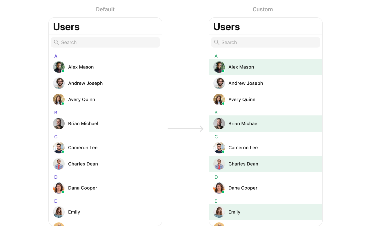
| **List Item Background** | Background color for individual list items. | `CometChatUsers.style.listItemBackground = .clear` |
| **List Item Border Width** | Border width for individual list items. | `CometChatUsers.style.listItemBorderWidth = 0` |
| **List Item Border Color** | Border color for individual list items. | `CometChatUsers.style.listItemBorderColor = CometChatTheme.borderColorLight` |
| **List Item Corner Radius** | Corner radius for list items. | `CometChatUsers.style.listItemCornerRadius = CometChatCornerStyle.init(cornerRadius: 0)` |
| **Selection Image Tint Color** | Tint color for selection indicator in list items. | `CometChatUsers.style.listItemSelectionImageTint = CometChatTheme.iconColorHighlight` |
| **Selected Background Color** | Background color for selected list items. | `CometChatUsers.style.listItemSelectedBackground = .clear` |
| **Deselected Image Tint Color** | Tint color for the deselected state image. | `CometChatUsers.style.listItemDeSelectedImageTint = CometChatTheme.borderColorDefault` |
| **Header Title Color** | Text color for section header titles in the list. | `CometChatUsers.style.headerTitleColor = CometChatTheme.textColorHighlight` |
| **Header Title Font** | Font for section header titles. | `CometChatUsers.style.headerTitleFont = CometChatTypography.Heading4.medium` |
***
### Functionality
These are a set of small functional customizations that allow you to fine-tune the overall experience of the component. With these, you can change text, set custom icons, and toggle the visibility of UI elements.
Below is a list of customizations along with corresponding code snippets
| Method | Description | Code |
| -------------------------- | --------------------------------------------------------------------- | ---------------------------------------------------------------- |
| set(userRequestBuilder:) | Sets a custom request builder for fetching users. | `.set(userRequestBuilder: UsersRequest.UsersRequestBuilder())` |
| set(searchRequestBuilder:) | Sets a custom request builder for searching users. | `.set(searchRequestBuilder: UsersRequest.UsersRequestBuilder())` |
| set(searchKeyword:) | Sets a search keyword for filtering users. | `.set(searchKeyword: "John")` |
| hideErrorView | Hides the error state view. | `hideErrorView = true` |
| hideNavigationBar | Hides or shows the navigation bar. | `hideNavigationBar = true` |
| hideSearch | Hides the search bar. | `hideSearch = true` |
| hideBackButton | Hides the back button. | `hideBackButton = true` |
| hideLoadingState | Hides the loading state indicator. | `hideLoadingState = true` |
| hideUserStatus | Hides the online/offline status of users. | `hideUserStatus = true` |
| hideSectionHeader | Hides the section header for table view indicating initials of users. | `hideSectionHeader = true` |
***
### Advance
For advanced-level customization, you can set custom views to the component. This lets you tailor each aspect of the component to fit your exact needs and application aesthetics. You can create and define your views, layouts, and UI elements and then incorporate those into the component.
***
#### SetOptions
You can define custom options for each user using .set(options:). This method allows you to return an array of CometChatUserOption based on the user object.
```swift theme={null}
cometChatUsers.set(options: { user in
return [CometChatUserOptions]
})
```
***
#### AddOptions
You can dynamically add options to users using .add(options:). This method lets you return additional CometChatUserOption elements.
```swift theme={null}
cometChatUsers.add(options: { user in
return [ArchiveOption()]
})
```
***
#### SetListItemView
With this function, you can assign a custom ListItem to the users Component.
```swift theme={null}
let cometChatUser = CometChatUsers()
cometChatUser.set(listItemView: { user in
//Perform Your Actions
})
```
List of properties exposed by MessageListStyle
| **Property** | **Description** | **Code** |
| ----------------------------------- | ----------------------------------------------------------------- | ---------------------------------------------------------------------------------------- |
| **List Item Selected Image** | Image shown when a list item is selected. | `CometChatUsers.style.listItemSelectedImage = UIImage()` |
| **List Item Deselected Image** | Image shown when a list item is deselected. | `CometChatUsers.style.listItemDeSelectedImage = UIImage()` |
| **Search Icon Tint Color** | Tint color for the search icon in the search bar. | `CometChatUsers.style.searchIconTintColor = UIColor()` |
| **Search Bar Style** | Style of the search bar (e.g., default, prominent). | `CometChatUsers.style.searchBarStyle = .default` |
| **Search Tint Color** | Tint color for the search bar elements. | `CometChatUsers.style.searchTintColor = UIColor?` |
| **Search Bar Tint Color** | Background color for the search bar (excluding text input). | `CometChatUsers.style.searchBarTintColor = UIColor?` |
| **Placeholder Text Color** | Color of the placeholder text in the search bar. | `CometChatUsers.style.searchBarPlaceholderTextColor = UIColor?` |
| **Placeholder Text Font** | Font of the placeholder text in the search bar. | `CometChatUsers.style.searchBarPlaceholderTextFont = UIFont?` |
| **Search Bar Text Color** | Color of the entered text in the search bar. | `CometChatUsers.style.searchBarTextColor = UIColor?` |
| **Search Bar Text Font** | Font of the entered text in the search bar. | `CometChatUsers.style.searchBarTextFont = UIFont?` |
| **Search Bar Background Color** | Background color of the search bar’s text input area. | `CometChatUsers.style.searchBarBackgroundColor = UIColor?` |
| **Cancel Icon Tint Color** | Tint color for the cancel button in the search bar. | `CometChatUsers.style.searchBarCancelIconTintColor = UIColor?` |
| **Cross Icon Tint Color** | Tint color for the clear (cross) button in the search bar. | `CometChatUsers.style.searchBarCrossIconTintColor = UIColor?` |
| **Background Color** | Background color for the entire screen or view. | `.backgroundColor = CometChatTheme.backgroundColor01` |
| **Border Width** | Border width for the search bar or container. | `CometChatUsers.style.borderWidth = 0` |
| **Border Color** | Color of the border, default is clear. | `CometChatUsers.style.borderColor = .clear` |
| **Corner Radius** | Corner radius for search bar or other elements. | `CometChatUsers.style.cornerRadius = CometChatCornerStyle.init(cornerRadius: 0)` |
| **Title Text Color** | Text color for title elements within the list or navigation bar. | `CometChatUsers.style.titleColor = CometChatTheme.textColorPrimary` |
| **Title Font** | Font for title text. | `CometChatUsers.style.titleFont = CometChatTypography.Heading4.medium` |
| **Large Title Text Color** | Text color for large titles. | `CometChatUsers.style.largeTitleColor = CometChatTheme.textColorPrimary` |
| **Large Title Font** | Font for large titles. | `CometChatUsers.style.largeTitleFont = UIFont?` |
| **Navigation Bar Tint Color** | Tint color for the navigation bar background. | `CometChatUsers.style.navigationBarTintColor = CometChatTheme.backgroundColor01` |
| **Navigation Bar Items Tint Color** | Tint color for navigation bar items (buttons, icons). | `CometChatUsers.style.navigationBarItemsTintColor = CometChatTheme.iconColorHighlight` |
| **Error Title Font** | Font for the error title displayed in UI. | `CometChatUsers.style.errorTitleTextFont = CometChatTypography.Heading3.bold` |
| **Error Title Text Color** | Text color for the error title. | `CometChatUsers.style.errorTitleTextColor = CometChatTheme.textColorPrimary` |
| **Error Subtitle Font** | Font for the subtitle of error messages. | `CometChatUsers.style.errorSubTitleFont = CometChatTypography.Body.regular` |
| **Error Subtitle Text Color** | Text color for the subtitle of error messages. | `CometChatUsers.style.errorSubTitleTextColor = CometChatTheme.textColorSecondary` |
| **Retry Button Text Color** | Text color for the retry button in error states. | `CometChatUsers.style.retryButtonTextColor = CometChatTheme.buttonTextColor` |
| **Retry Button Text Font** | Font for the retry button text. | `CometChatUsers.style.retryButtonTextFont = CometChatTypography.Button.medium` |
| **Retry Button Background Color** | Background color for the retry button. | `CometChatUsers.style.retryButtonBackgroundColor = CometChatTheme.primaryColor` |
| **Retry Button Border Color** | Border color for the retry button. | `CometChatUsers.style.retryButtonBorderColor = .clear` |
| **Retry Button Border Width** | Border width for the retry button. | `CometChatUsers.style.retryButtonBorderWidth = 0` |
| **Retry Button Corner Radius** | Corner radius for the retry button. | `CometChatUsers.style.retryButtonCornerRadius = CometChatCornerStyle?` |
| **Empty State Title Font** | Font for the empty state title (when no users/items are present). | `CometChatUsers.style.emptyTitleTextFont = CometChatTypography.Heading3.bold` |
| **Empty State Title Color** | Text color for the empty state title. | `CometChatUsers.style.emptyTitleTextColor = CometChatTheme.textColorPrimary` |
| **Empty Subtitle Font** | Font for the subtitle in the empty state. | `CometChatUsers.style.emptySubTitleFont = CometChatTypography.Body.regular` |
| **Empty Subtitle Text Color** | Text color for the subtitle in the empty state. | `CometChatUsers.style.emptySubTitleTextColor = CometChatTheme.textColorSecondary` |
| **Table View Separator Color** | Color for the table view separator. | `CometChatUsers.style.tableViewSeparator = .clear` |
| **List Item Title Text Color** | Text color for list item titles. | `CometChatUsers.style.listItemTitleTextColor = CometChatTheme.textColorPrimary` |
| **List Item Title Font** | Font for list item titles. | `CometChatUsers.style.listItemTitleFont = CometChatTypography.Heading4.medium` |
| **List Item Subtitle Text Color** | Text color for list item subtitles. | `CometChatUsers.style.listItemSubTitleTextColor = CometChatTheme.textColorSecondary` |
| **List Item Subtitle Font** | Font for list item subtitles. | `CometChatUsers.style.listItemSubTitleFont = CometChatTypography.Body.regular` |
| **List Item Background** | Background color for individual list items. | `CometChatUsers.style.listItemBackground = .clear` |
| **List Item Border Width** | Border width for individual list items. | `CometChatUsers.style.listItemBorderWidth = 0` |
| **List Item Border Color** | Border color for individual list items. | `CometChatUsers.style.listItemBorderColor = CometChatTheme.borderColorLight` |
| **List Item Corner Radius** | Corner radius for list items. | `CometChatUsers.style.listItemCornerRadius = CometChatCornerStyle.init(cornerRadius: 0)` |
| **Selection Image Tint Color** | Tint color for selection indicator in list items. | `CometChatUsers.style.listItemSelectionImageTint = CometChatTheme.iconColorHighlight` |
| **Selected Background Color** | Background color for selected list items. | `CometChatUsers.style.listItemSelectedBackground = .clear` |
| **Deselected Image Tint Color** | Tint color for the deselected state image. | `CometChatUsers.style.listItemDeSelectedImageTint = CometChatTheme.borderColorDefault` |
| **Header Title Color** | Text color for section header titles in the list. | `CometChatUsers.style.headerTitleColor = CometChatTheme.textColorHighlight` |
| **Header Title Font** | Font for section header titles. | `CometChatUsers.style.headerTitleFont = CometChatTypography.Heading4.medium` |
***
### Functionality
These are a set of small functional customizations that allow you to fine-tune the overall experience of the component. With these, you can change text, set custom icons, and toggle the visibility of UI elements.
Below is a list of customizations along with corresponding code snippets
| Method | Description | Code |
| -------------------------- | --------------------------------------------------------------------- | ---------------------------------------------------------------- |
| set(userRequestBuilder:) | Sets a custom request builder for fetching users. | `.set(userRequestBuilder: UsersRequest.UsersRequestBuilder())` |
| set(searchRequestBuilder:) | Sets a custom request builder for searching users. | `.set(searchRequestBuilder: UsersRequest.UsersRequestBuilder())` |
| set(searchKeyword:) | Sets a search keyword for filtering users. | `.set(searchKeyword: "John")` |
| hideErrorView | Hides the error state view. | `hideErrorView = true` |
| hideNavigationBar | Hides or shows the navigation bar. | `hideNavigationBar = true` |
| hideSearch | Hides the search bar. | `hideSearch = true` |
| hideBackButton | Hides the back button. | `hideBackButton = true` |
| hideLoadingState | Hides the loading state indicator. | `hideLoadingState = true` |
| hideUserStatus | Hides the online/offline status of users. | `hideUserStatus = true` |
| hideSectionHeader | Hides the section header for table view indicating initials of users. | `hideSectionHeader = true` |
***
### Advance
For advanced-level customization, you can set custom views to the component. This lets you tailor each aspect of the component to fit your exact needs and application aesthetics. You can create and define your views, layouts, and UI elements and then incorporate those into the component.
***
#### SetOptions
You can define custom options for each user using .set(options:). This method allows you to return an array of CometChatUserOption based on the user object.
```swift theme={null}
cometChatUsers.set(options: { user in
return [CometChatUserOptions]
})
```
***
#### AddOptions
You can dynamically add options to users using .add(options:). This method lets you return additional CometChatUserOption elements.
```swift theme={null}
cometChatUsers.add(options: { user in
return [ArchiveOption()]
})
```
***
#### SetListItemView
With this function, you can assign a custom ListItem to the users Component.
```swift theme={null}
let cometChatUser = CometChatUsers()
cometChatUser.set(listItemView: { user in
//Perform Your Actions
})
```
 You can indeed create a custom listitem UIView file named `Custom_User_ListItem_View` for more complex or unique list items.
Afterwards, seamlessly integrate this `Custom_User_ListItem_View` UIView file into the `.setListItemView` method within **CometChatUsers()**.
You can create a `CustomListItemView` as a custom `UIView`. Which we will inflate in `setListItemView()`
```swift swift theme={null}
import UIKit
import CometChatUIKitSwift
class CustomListItem: UIView {
// Initialize UI components
private var profileImageView: CometChatAvatar = {
let imageView = CometChatAvatar(image: UIImage())
imageView.translatesAutoresizingMaskIntoConstraints = false // Important for manual layout
return imageView
}()
private var nameLabel: UILabel = {
let label = UILabel()
label.translatesAutoresizingMaskIntoConstraints = false // Important for manual layout
return label
}()
override init(frame: CGRect) {
super.init(frame: frame)
setupUI()
}
required init?(coder aDecoder: NSCoder) {
fatalError("init(coder:) has not been implemented")
}
private func setupUI() {
addSubview(profileImageView)
addSubview(nameLabel)
NSLayoutConstraint.activate([
// Profile image constraints
profileImageView.leadingAnchor.constraint(equalTo: leadingAnchor, constant: 8),
profileImageView.centerYAnchor.constraint(equalTo: centerYAnchor),
profileImageView.widthAnchor.constraint(equalToConstant: 40),
profileImageView.heightAnchor.constraint(equalToConstant: 40),
nameLabel.leadingAnchor.constraint(equalTo: profileImageView.trailingAnchor, constant: 8),
nameLabel.trailingAnchor.constraint(equalTo: trailingAnchor, constant: -8),
nameLabel.centerYAnchor.constraint(equalTo: centerYAnchor)
])
}
func set(user: User) {
var avatarURL: String?
if let group = conversation.conversationWith as? Group {
nameLabel.text = group.name
avatarURL = group.icon
}
if let user = conversation.conversationWith as? User {
nameLabel.text = user.name
avatarURL = user.avatar
}
self.profileImageView.setAvatar(avatarUrl: avatarURL, with: nameLabel.text)
}
}
```
***
#### SetLeadingView
You can modify the leading view of a user cell using .set(leadingView:).
```swift theme={null}
cometChatUsers.set(leadingView: { user in
let view = CustomLeadingView()
return view
})
```
Demonstration
You can indeed create a custom listitem UIView file named `Custom_User_ListItem_View` for more complex or unique list items.
Afterwards, seamlessly integrate this `Custom_User_ListItem_View` UIView file into the `.setListItemView` method within **CometChatUsers()**.
You can create a `CustomListItemView` as a custom `UIView`. Which we will inflate in `setListItemView()`
```swift swift theme={null}
import UIKit
import CometChatUIKitSwift
class CustomListItem: UIView {
// Initialize UI components
private var profileImageView: CometChatAvatar = {
let imageView = CometChatAvatar(image: UIImage())
imageView.translatesAutoresizingMaskIntoConstraints = false // Important for manual layout
return imageView
}()
private var nameLabel: UILabel = {
let label = UILabel()
label.translatesAutoresizingMaskIntoConstraints = false // Important for manual layout
return label
}()
override init(frame: CGRect) {
super.init(frame: frame)
setupUI()
}
required init?(coder aDecoder: NSCoder) {
fatalError("init(coder:) has not been implemented")
}
private func setupUI() {
addSubview(profileImageView)
addSubview(nameLabel)
NSLayoutConstraint.activate([
// Profile image constraints
profileImageView.leadingAnchor.constraint(equalTo: leadingAnchor, constant: 8),
profileImageView.centerYAnchor.constraint(equalTo: centerYAnchor),
profileImageView.widthAnchor.constraint(equalToConstant: 40),
profileImageView.heightAnchor.constraint(equalToConstant: 40),
nameLabel.leadingAnchor.constraint(equalTo: profileImageView.trailingAnchor, constant: 8),
nameLabel.trailingAnchor.constraint(equalTo: trailingAnchor, constant: -8),
nameLabel.centerYAnchor.constraint(equalTo: centerYAnchor)
])
}
func set(user: User) {
var avatarURL: String?
if let group = conversation.conversationWith as? Group {
nameLabel.text = group.name
avatarURL = group.icon
}
if let user = conversation.conversationWith as? User {
nameLabel.text = user.name
avatarURL = user.avatar
}
self.profileImageView.setAvatar(avatarUrl: avatarURL, with: nameLabel.text)
}
}
```
***
#### SetLeadingView
You can modify the leading view of a user cell using .set(leadingView:).
```swift theme={null}
cometChatUsers.set(leadingView: { user in
let view = CustomLeadingView()
return view
})
```
Demonstration
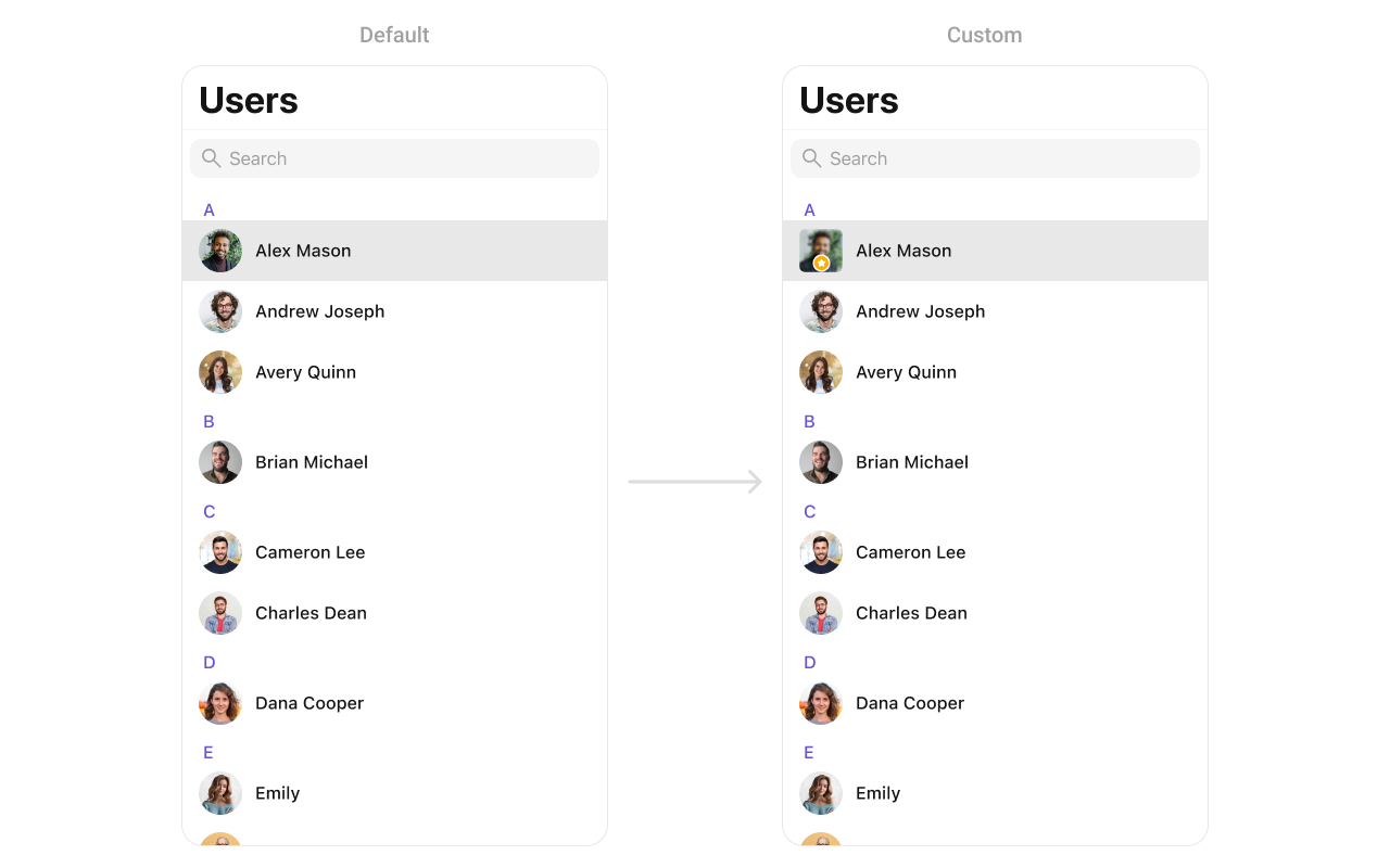 You can create a `CustomLeadingView` as a custom `UIView`. Which we will inflate in `setLeadingView()`
```swift theme={null}
import UIKit
class CustomLeadingView: UIView {
private let imageView: UIImageView = {
let imageView = UIImageView()
imageView.contentMode = .scaleAspectFill
imageView.clipsToBounds = true
imageView.layer.cornerRadius = 10
return imageView
}()
private let badgeView: UIView = {
let view = UIView()
view.backgroundColor = .orange
view.layer.cornerRadius = 12
view.layer.borderWidth = 2
view.layer.borderColor = UIColor.white.cgColor
let icon = UIImageView(image: UIImage(systemName: "star.fill"))
icon.tintColor = .white
icon.translatesAutoresizingMaskIntoConstraints = false
view.addSubview(icon)
NSLayoutConstraint.activate([
icon.centerXAnchor.constraint(equalTo: view.centerXAnchor),
icon.centerYAnchor.constraint(equalTo: view.centerYAnchor),
icon.widthAnchor.constraint(equalToConstant: 14),
icon.heightAnchor.constraint(equalToConstant: 14)
])
return view
}()
init(image: UIImage?) {
super.init(frame: .zero)
imageView.image = image
addSubview(imageView)
addSubview(badgeView)
imageView.translatesAutoresizingMaskIntoConstraints = false
badgeView.translatesAutoresizingMaskIntoConstraints = false
NSLayoutConstraint.activate([
imageView.topAnchor.constraint(equalTo: topAnchor),
imageView.leadingAnchor.constraint(equalTo: leadingAnchor),
imageView.trailingAnchor.constraint(equalTo: trailingAnchor),
imageView.bottomAnchor.constraint(equalTo: bottomAnchor),
badgeView.widthAnchor.constraint(equalToConstant: 24),
badgeView.heightAnchor.constraint(equalToConstant: 24),
badgeView.bottomAnchor.constraint(equalTo: imageView.bottomAnchor, constant: -4),
badgeView.trailingAnchor.constraint(equalTo: imageView.trailingAnchor, constant: -4)
])
}
required init?(coder: NSCoder) {
fatalError("init(coder:) has not been implemented")
}
}
```
***
#### SetTitleView
You can customize the title view of a user cell using .set(titleView:).
```swift theme={null}
cometChatUsers.set(titleView: { user in
let view = CustomTitleView()
return view
})
```
Demonstration
You can create a `CustomLeadingView` as a custom `UIView`. Which we will inflate in `setLeadingView()`
```swift theme={null}
import UIKit
class CustomLeadingView: UIView {
private let imageView: UIImageView = {
let imageView = UIImageView()
imageView.contentMode = .scaleAspectFill
imageView.clipsToBounds = true
imageView.layer.cornerRadius = 10
return imageView
}()
private let badgeView: UIView = {
let view = UIView()
view.backgroundColor = .orange
view.layer.cornerRadius = 12
view.layer.borderWidth = 2
view.layer.borderColor = UIColor.white.cgColor
let icon = UIImageView(image: UIImage(systemName: "star.fill"))
icon.tintColor = .white
icon.translatesAutoresizingMaskIntoConstraints = false
view.addSubview(icon)
NSLayoutConstraint.activate([
icon.centerXAnchor.constraint(equalTo: view.centerXAnchor),
icon.centerYAnchor.constraint(equalTo: view.centerYAnchor),
icon.widthAnchor.constraint(equalToConstant: 14),
icon.heightAnchor.constraint(equalToConstant: 14)
])
return view
}()
init(image: UIImage?) {
super.init(frame: .zero)
imageView.image = image
addSubview(imageView)
addSubview(badgeView)
imageView.translatesAutoresizingMaskIntoConstraints = false
badgeView.translatesAutoresizingMaskIntoConstraints = false
NSLayoutConstraint.activate([
imageView.topAnchor.constraint(equalTo: topAnchor),
imageView.leadingAnchor.constraint(equalTo: leadingAnchor),
imageView.trailingAnchor.constraint(equalTo: trailingAnchor),
imageView.bottomAnchor.constraint(equalTo: bottomAnchor),
badgeView.widthAnchor.constraint(equalToConstant: 24),
badgeView.heightAnchor.constraint(equalToConstant: 24),
badgeView.bottomAnchor.constraint(equalTo: imageView.bottomAnchor, constant: -4),
badgeView.trailingAnchor.constraint(equalTo: imageView.trailingAnchor, constant: -4)
])
}
required init?(coder: NSCoder) {
fatalError("init(coder:) has not been implemented")
}
}
```
***
#### SetTitleView
You can customize the title view of a user cell using .set(titleView:).
```swift theme={null}
cometChatUsers.set(titleView: { user in
let view = CustomTitleView()
return view
})
```
Demonstration
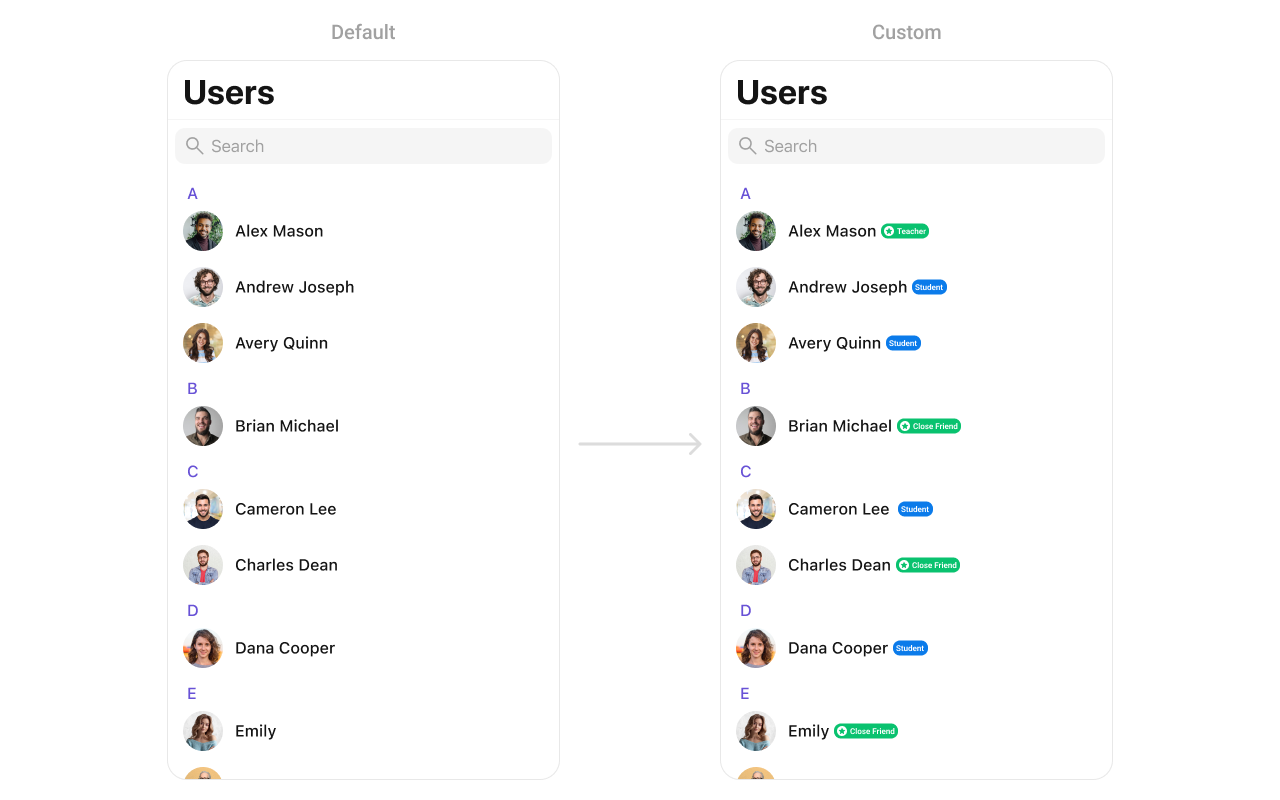 You can create a `CustomTitleView` as a custom `UIView`. Which we will inflate in `setTitleView()`
```swift theme={null}
import UIKit
class CustomTitleView: UIView {
private let nameLabel: UILabel = {
let label = UILabel()
label.font = UIFont.boldSystemFont(ofSize: 18)
label.textColor = .black
return label
}()
private let badgeLabel: UILabel = {
let label = UILabel()
label.font = UIFont.systemFont(ofSize: 14)
label.textColor = .white
label.backgroundColor = .systemGreen
label.text = "Teacher"
label.textAlignment = .center
label.layer.cornerRadius = 8
label.layer.masksToBounds = true
return label
}()
init(name: String, role: String) {
super.init(frame: .zero)
nameLabel.text = name
badgeLabel.text = " \(role) "
let stackView = UIStackView(arrangedSubviews: [nameLabel, badgeLabel])
stackView.axis = .horizontal
stackView.spacing = 8
stackView.alignment = .center
addSubview(stackView)
stackView.translatesAutoresizingMaskIntoConstraints = false
NSLayoutConstraint.activate([
stackView.leadingAnchor.constraint(equalTo: leadingAnchor),
stackView.trailingAnchor.constraint(equalTo: trailingAnchor),
stackView.topAnchor.constraint(equalTo: topAnchor),
stackView.bottomAnchor.constraint(equalTo: bottomAnchor)
])
}
required init?(coder: NSCoder) {
fatalError("init(coder:) has not been implemented")
}
}
```
***
#### SetTrailView
You can modify the trailing view of a user cell using .set(trailView:).
```swift theme={null}
cometChatUsers.set(trailView: { user in
let view = CustomTrailView()
return view
})
```
Demonstration
You can create a `CustomTitleView` as a custom `UIView`. Which we will inflate in `setTitleView()`
```swift theme={null}
import UIKit
class CustomTitleView: UIView {
private let nameLabel: UILabel = {
let label = UILabel()
label.font = UIFont.boldSystemFont(ofSize: 18)
label.textColor = .black
return label
}()
private let badgeLabel: UILabel = {
let label = UILabel()
label.font = UIFont.systemFont(ofSize: 14)
label.textColor = .white
label.backgroundColor = .systemGreen
label.text = "Teacher"
label.textAlignment = .center
label.layer.cornerRadius = 8
label.layer.masksToBounds = true
return label
}()
init(name: String, role: String) {
super.init(frame: .zero)
nameLabel.text = name
badgeLabel.text = " \(role) "
let stackView = UIStackView(arrangedSubviews: [nameLabel, badgeLabel])
stackView.axis = .horizontal
stackView.spacing = 8
stackView.alignment = .center
addSubview(stackView)
stackView.translatesAutoresizingMaskIntoConstraints = false
NSLayoutConstraint.activate([
stackView.leadingAnchor.constraint(equalTo: leadingAnchor),
stackView.trailingAnchor.constraint(equalTo: trailingAnchor),
stackView.topAnchor.constraint(equalTo: topAnchor),
stackView.bottomAnchor.constraint(equalTo: bottomAnchor)
])
}
required init?(coder: NSCoder) {
fatalError("init(coder:) has not been implemented")
}
}
```
***
#### SetTrailView
You can modify the trailing view of a user cell using .set(trailView:).
```swift theme={null}
cometChatUsers.set(trailView: { user in
let view = CustomTrailView()
return view
})
```
Demonstration
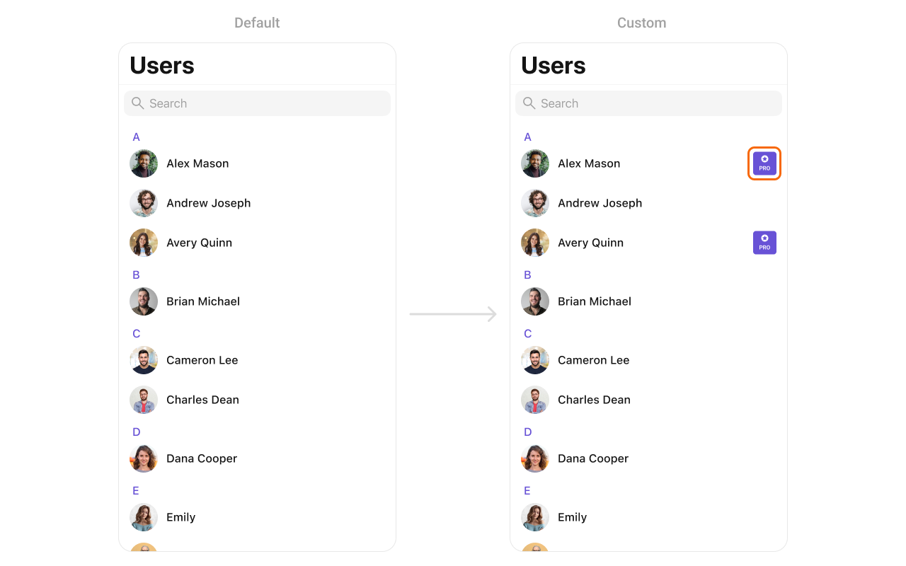 You can create a `CustomTrailView` as a custom `UIView`. Which we will inflate in `setTrailView()`
```swift theme={null}
import UIKit
class CustomTrailView: UIView {
private let badgeView: UIView = {
let view = UIView()
view.backgroundColor = .purple
view.layer.cornerRadius = 12
view.translatesAutoresizingMaskIntoConstraints = false
return view
}()
private let icon: UIImageView = {
let imageView = UIImageView(image: UIImage(systemName: "star.fill"))
imageView.tintColor = .white
imageView.translatesAutoresizingMaskIntoConstraints = false
return imageView
}()
private let label: UILabel = {
let label = UILabel()
label.text = "PRO"
label.font = UIFont.boldSystemFont(ofSize: 14)
label.textColor = .white
label.translatesAutoresizingMaskIntoConstraints = false
return label
}()
init() {
super.init(frame: .zero)
addSubview(badgeView)
badgeView.addSubview(icon)
badgeView.addSubview(label)
NSLayoutConstraint.activate([
badgeView.leadingAnchor.constraint(equalTo: leadingAnchor),
badgeView.trailingAnchor.constraint(equalTo: trailingAnchor),
badgeView.topAnchor.constraint(equalTo: topAnchor),
badgeView.bottomAnchor.constraint(equalTo: bottomAnchor),
icon.centerXAnchor.constraint(equalTo: badgeView.centerXAnchor),
icon.topAnchor.constraint(equalTo: badgeView.topAnchor, constant: 4),
icon.widthAnchor.constraint(equalToConstant: 16),
icon.heightAnchor.constraint(equalToConstant: 16),
label.centerXAnchor.constraint(equalTo: badgeView.centerXAnchor),
label.topAnchor.constraint(equalTo: icon.bottomAnchor, constant: 2),
label.bottomAnchor.constraint(equalTo: badgeView.bottomAnchor, constant: -4)
])
}
required init?(coder: NSCoder) {
fatalError("init(coder:) has not been implemented")
}
}
```
***
#### SetSubTitleView
You can customize the subtitle view for each users item to meet your requirements
```swift theme={null}
let cometChatUser = CometChatUsers()
cometChatUser.set(subtitleView: { user in
let view = CustomSubtitleView()
return view
})
```
**Example**
Demonstration
You can create a `CustomTrailView` as a custom `UIView`. Which we will inflate in `setTrailView()`
```swift theme={null}
import UIKit
class CustomTrailView: UIView {
private let badgeView: UIView = {
let view = UIView()
view.backgroundColor = .purple
view.layer.cornerRadius = 12
view.translatesAutoresizingMaskIntoConstraints = false
return view
}()
private let icon: UIImageView = {
let imageView = UIImageView(image: UIImage(systemName: "star.fill"))
imageView.tintColor = .white
imageView.translatesAutoresizingMaskIntoConstraints = false
return imageView
}()
private let label: UILabel = {
let label = UILabel()
label.text = "PRO"
label.font = UIFont.boldSystemFont(ofSize: 14)
label.textColor = .white
label.translatesAutoresizingMaskIntoConstraints = false
return label
}()
init() {
super.init(frame: .zero)
addSubview(badgeView)
badgeView.addSubview(icon)
badgeView.addSubview(label)
NSLayoutConstraint.activate([
badgeView.leadingAnchor.constraint(equalTo: leadingAnchor),
badgeView.trailingAnchor.constraint(equalTo: trailingAnchor),
badgeView.topAnchor.constraint(equalTo: topAnchor),
badgeView.bottomAnchor.constraint(equalTo: bottomAnchor),
icon.centerXAnchor.constraint(equalTo: badgeView.centerXAnchor),
icon.topAnchor.constraint(equalTo: badgeView.topAnchor, constant: 4),
icon.widthAnchor.constraint(equalToConstant: 16),
icon.heightAnchor.constraint(equalToConstant: 16),
label.centerXAnchor.constraint(equalTo: badgeView.centerXAnchor),
label.topAnchor.constraint(equalTo: icon.bottomAnchor, constant: 2),
label.bottomAnchor.constraint(equalTo: badgeView.bottomAnchor, constant: -4)
])
}
required init?(coder: NSCoder) {
fatalError("init(coder:) has not been implemented")
}
}
```
***
#### SetSubTitleView
You can customize the subtitle view for each users item to meet your requirements
```swift theme={null}
let cometChatUser = CometChatUsers()
cometChatUser.set(subtitleView: { user in
let view = CustomSubtitleView()
return view
})
```
**Example**
Demonstration
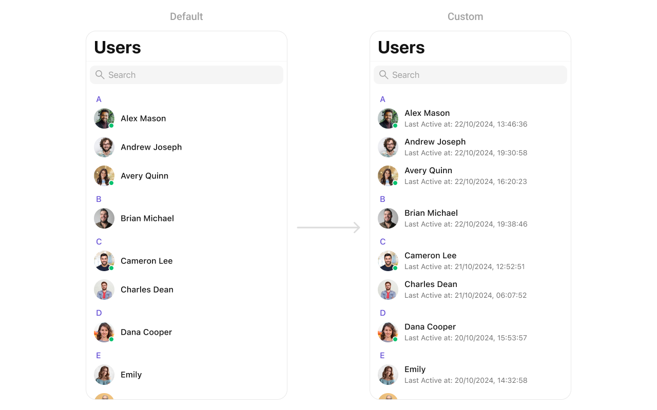 You can seamlessly integrate this `CustomSubtitleView` UIView file into the `.set(subtitleView:)` method within CometChatUsers.
```swift theme={null}
import UIKit
class CustomSubtitleView: UILabel {
init(lastActiveDate: String) {
super.init(frame: .zero)
self.text = "Last Active at: \(lastActiveDate)"
self.textColor = UIColor.gray
self.font = UIFont.systemFont(ofSize: 14)
self.numberOfLines = 1
}
required init?(coder: NSCoder) {
fatalError("init(coder:) has not been implemented")
}
}
```
***
#### SetLoadingView
You can set a custom loading view using .set(loadingView:). This method accepts a UIView to display while data is being fetched.
```swift theme={null}
let loadingIndicator = UIActivityIndicatorView(style: .medium)
loadingIndicator.startAnimating()
cometChatUsers.set(loadingView: loadingIndicator)
```
***
#### SetErrorView
You can customize the error view using .set(errorView:). This method accepts a UIView that appears when an error occurs.
```swift theme={null}
let errorLabel = UILabel()
errorLabel.text = "Something went wrong!"
errorLabel.textColor = .red
cometChatUsers.set(errorView: errorLabel)
```
***
#### SetEmptyView
You can customize the empty state view using .set(emptyView:). This method accepts a UIView that appears when no user are available.
```swift theme={null}
let emptyLabel = UILabel()
emptyLabel.text = "No users found"
emptyLabel.textColor = .gray
emptyLabel.textAlignment = .center
cometChatUsers.set(emptyView: emptyLabel)
```
***
You can seamlessly integrate this `CustomSubtitleView` UIView file into the `.set(subtitleView:)` method within CometChatUsers.
```swift theme={null}
import UIKit
class CustomSubtitleView: UILabel {
init(lastActiveDate: String) {
super.init(frame: .zero)
self.text = "Last Active at: \(lastActiveDate)"
self.textColor = UIColor.gray
self.font = UIFont.systemFont(ofSize: 14)
self.numberOfLines = 1
}
required init?(coder: NSCoder) {
fatalError("init(coder:) has not been implemented")
}
}
```
***
#### SetLoadingView
You can set a custom loading view using .set(loadingView:). This method accepts a UIView to display while data is being fetched.
```swift theme={null}
let loadingIndicator = UIActivityIndicatorView(style: .medium)
loadingIndicator.startAnimating()
cometChatUsers.set(loadingView: loadingIndicator)
```
***
#### SetErrorView
You can customize the error view using .set(errorView:). This method accepts a UIView that appears when an error occurs.
```swift theme={null}
let errorLabel = UILabel()
errorLabel.text = "Something went wrong!"
errorLabel.textColor = .red
cometChatUsers.set(errorView: errorLabel)
```
***
#### SetEmptyView
You can customize the empty state view using .set(emptyView:). This method accepts a UIView that appears when no user are available.
```swift theme={null}
let emptyLabel = UILabel()
emptyLabel.text = "No users found"
emptyLabel.textColor = .gray
emptyLabel.textAlignment = .center
cometChatUsers.set(emptyView: emptyLabel)
```
***