> ## Documentation Index
> Fetch the complete documentation index at: https://cometchat-013b37f0.mintlify.site/llms.txt
> Use this file to discover all available pages before exploring further.
# Confirm Dialog
`CometChatConfirmDialog` is a customizable alert dialog .
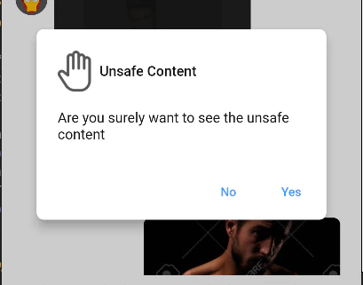 ## How to integrate CometChatConfirmDialog ?
Since `CometChatConfirmDialog` is a `AlertDialog`, it can be called by function `showCometChatConfirmDialog` . `CometChatConfirmDialog` includes various attributes to customize its UI.
#### Usage
```dart theme={null}
showCometChatConfirmDialog(
context: context,
confirmButtonText: "yes",
cancelButtonText: "no",
messageText: "this is a message",
onCancel: () {
// Write on cancel function here
Navigator.pop(context);
},
style: ConfirmDialogStyle(
backgroundColor:Colors.lightBlue,
shadowColor: Colors.teal,
confirmButtonTextStyle:TextStyle(fontSize: 12, color: Colors.yellow),
cancelButtonTextStyle: TextStyle(fontSize: 12, color: Colors.pink)
onConfirm: () async {
// write on Confirm function here
Navigator.pop(context);
}
)
);
```
***
## Properties
| Parameters | Type | Description |
| --------------------- | ------------------ | ------------------------------------------------------------------------------------------------ |
| **context** | BuildContext | required to determine the location in the widget tree where the confirm dialog needs to be shown |
| **title** | Widget | used to set title on top of the confirm dialog |
| **messageText** | Widget | used to set the text for the message to display on the dialog |
| **confirmButtonText** | String | used to set the text on the confirm button |
| **cancelButtonText** | String | used to set the text on the cancel button |
| **onConfirm** | Function() | required to set function to be called when clicked on confirm Button |
| **onCancel** | Function() | required to set function to be called when clicked on cancel Button |
| **style** | ConfirmDialogStyle | used to customize the confirm dialog |
***
## ConfirmDialogStyle
style class to alter Confirm dialog styling properties.
***
### Properties
| Parameters | Type | Description |
| -------------------------- | --------- | ---------------------------------------- |
| **backgroundColor** | Color | Used to set background color |
| **shadowColor** | Color | Used to set shadow color |
| **confirmButtonTextStyle** | TextStyle | Used to set confirm button text style |
| **cancelButtonTextStyle** | TextStyle | Used to set the cancel button text style |
## How to integrate CometChatConfirmDialog ?
Since `CometChatConfirmDialog` is a `AlertDialog`, it can be called by function `showCometChatConfirmDialog` . `CometChatConfirmDialog` includes various attributes to customize its UI.
#### Usage
```dart theme={null}
showCometChatConfirmDialog(
context: context,
confirmButtonText: "yes",
cancelButtonText: "no",
messageText: "this is a message",
onCancel: () {
// Write on cancel function here
Navigator.pop(context);
},
style: ConfirmDialogStyle(
backgroundColor:Colors.lightBlue,
shadowColor: Colors.teal,
confirmButtonTextStyle:TextStyle(fontSize: 12, color: Colors.yellow),
cancelButtonTextStyle: TextStyle(fontSize: 12, color: Colors.pink)
onConfirm: () async {
// write on Confirm function here
Navigator.pop(context);
}
)
);
```
***
## Properties
| Parameters | Type | Description |
| --------------------- | ------------------ | ------------------------------------------------------------------------------------------------ |
| **context** | BuildContext | required to determine the location in the widget tree where the confirm dialog needs to be shown |
| **title** | Widget | used to set title on top of the confirm dialog |
| **messageText** | Widget | used to set the text for the message to display on the dialog |
| **confirmButtonText** | String | used to set the text on the confirm button |
| **cancelButtonText** | String | used to set the text on the cancel button |
| **onConfirm** | Function() | required to set function to be called when clicked on confirm Button |
| **onCancel** | Function() | required to set function to be called when clicked on cancel Button |
| **style** | ConfirmDialogStyle | used to customize the confirm dialog |
***
## ConfirmDialogStyle
style class to alter Confirm dialog styling properties.
***
### Properties
| Parameters | Type | Description |
| -------------------------- | --------- | ---------------------------------------- |
| **backgroundColor** | Color | Used to set background color |
| **shadowColor** | Color | Used to set shadow color |
| **confirmButtonTextStyle** | TextStyle | Used to set confirm button text style |
| **cancelButtonTextStyle** | TextStyle | Used to set the cancel button text style |