> ## Documentation Index
> Fetch the complete documentation index at: https://cometchat-013b37f0.mintlify.site/llms.txt
> Use this file to discover all available pages before exploring further.
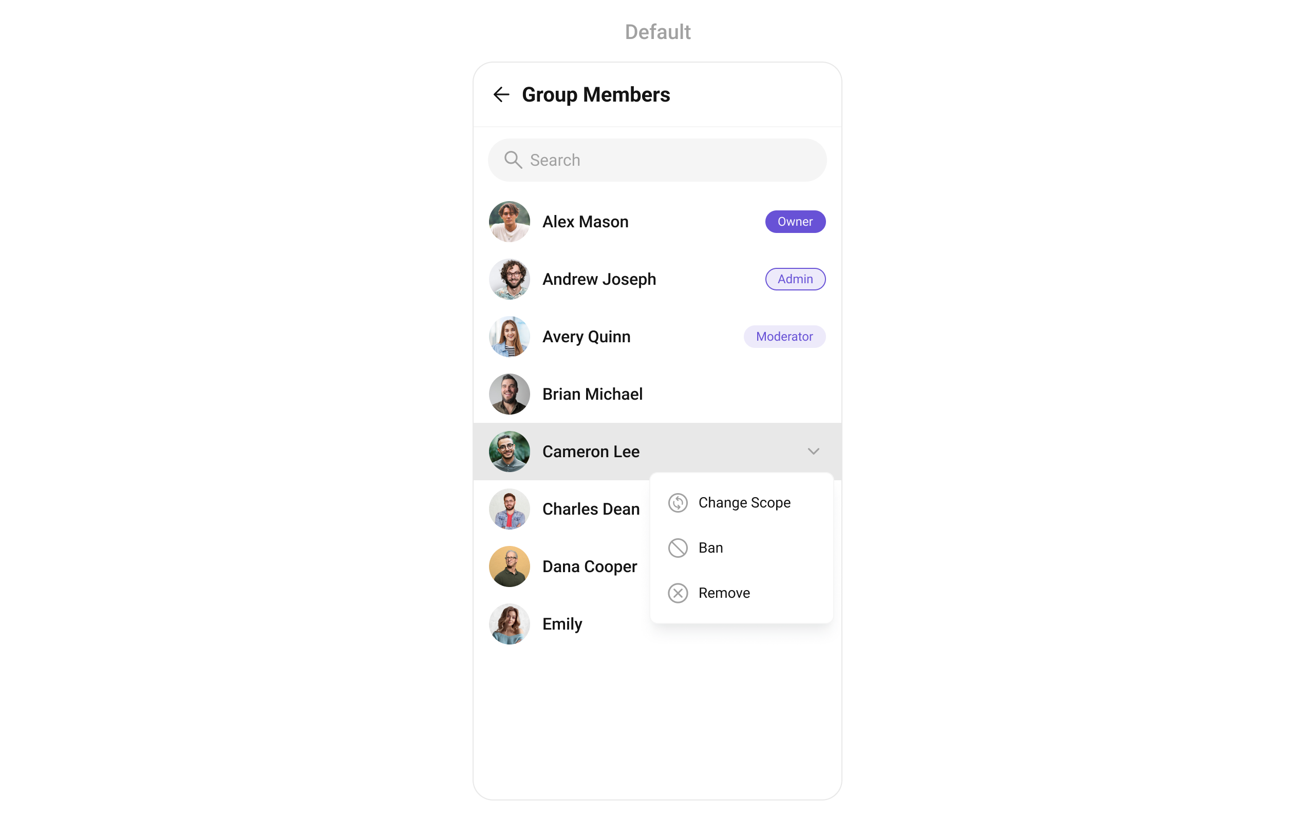
# Group Members
## Overview
`CometChatGroupMembers` is a versatile [Widget](/ui-kit/flutter/components-overview#components) designed to showcase all users who are either added to or invited to a group, thereby enabling them to participate in group discussions, access shared content, and engage in collaborative activities. `CometChatGroupMembers` have the capability to communicate in real-time through messaging, voice and video calls, and various other interactions. Additionally, they can interact with each other, share files, and join calls based on the permissions established by the group administrator or owner.
 The `CometChatGroupMembers` widget is composed of the following BaseWidgets:
| Widgets | Description |
| ---------------------------------------------- | ----------------------------------------------------------------------------------------------------------------------------------------------------------------------------------------------------------------------------- |
| [CometChatListBase](/ui-kit/flutter/list-base) | `CometChatListBase` serves as a container widget equipped with a title (navigationBar), search functionality (search-bar), background settings, and a container for embedding a list widget. |
| [CometChatListItem](/ui-kit/flutter/list-item) | This widget renders information extracted from a `User` object onto a tile, featuring a title, subtitle, leading widget, and trailing widget. experience, facilitating seamless navigation and interaction within the widget. |
***
## Usage
### Integration
`CometChatGroupMembers` , as a Composite Widget, offers flexible integration options, allowing it to be launched directly via button clicks or any user-triggered action.
You can launch `CometChatGroupMembers` directly using `Navigator.push` , or you can define it as a widget within the `build` method of your `State` class.
##### 1. Using Navigator to Launch `CometChatGroupMembers`
```dart theme={null}
Navigator.push(context, MaterialPageRoute(builder: (context) => CometChatGroupMembers(group: Group(guid: "", name: "", type: "")))); // A group object is required to launch this widget.
```
##### 2. Embedding `CometChatGroupMembers` as a Widget in the build Method
```dart theme={null}
import 'package:cometchat_chat_uikit/cometchat_chat_uikit.dart';
import 'package:flutter/material.dart';
class GroupMembers extends StatefulWidget {
const GroupMembers({super.key});
@override
State createState() => _GroupMembersState();
}
class _GroupMembersState extends State {
@override
Widget build(BuildContext context) {
return Scaffold(
body: SafeArea(
child: CometChatGroupMembers(
group: Group(guid: "", name: "", type: ""),
) // A group object is required to launch this widget.
)
);
}
}
```
***
### Actions
[Actions](/ui-kit/flutter/components-overview#actions) dictate how a widget functions. They are divided into two types: Predefined and User-defined. You can override either type, allowing you to tailor the behavior of the widget to fit your specific needs.
##### 1. onItemTap
This method proves valuable when users seek to override onItemClick functionality within `CometChatGroupMembers` , empowering them with greater control and customization options.
The `onItemTap` action doesn't have a predefined behavior. You can override this action using the following code snippet.
```dart theme={null}
CometChatGroupMembers(
group: Group(guid: "", name: "", type: ""), // A group object is required to launch this widget.
onItemTap: (groupMember) {
// TODO("Not yet implemented")
},
)
```
***
##### 2. onItemLongPress
This method becomes invaluable when users seek to override long-click functionality within `CometChatGroupMembers` , offering them enhanced control and flexibility in their interactions.
The `onItemLongPress` action doesn't have a predefined behavior. You can override this action using the following code snippet.
```dart theme={null}
CometChatGroupMembers(
group: Group(guid: "", name: "", type: ""), // A group object is required to launch this widget.
onItemLongPress: (groupMember) {
// TODO("Not yet implemented")
},
)
```
***
##### 3. onBack
Enhance your application's functionality by leveraging the `onBack` feature. This capability allows you to customize the behavior associated with navigating back within your app. Utilize the provided code snippet to override default behaviors and tailor the user experience according to your specific requirements.
```dart theme={null}
CometChatGroupMembers(
group: Group(guid: "", name: "", type: ""), // A group object is required to launch this widget.
onBack: () {
// TODO("Not yet implemented")
},
)
```
***
##### 4. onError
You can customize this behavior by using the provided code snippet to override the `onError` and improve error handling.
```dart theme={null}
CometChatGroupMembers(
group: Group(guid: "", name: "", type: ""), // A group object is required to launch this widget.
onError: (e) {
// TODO("Not yet implemented")
},
)
```
***
##### 5. onSelection
When the `onSelection` event is triggered, it furnishes the list of selected members. This event can be invoked by any button or action within the interface. You have the flexibility to implement custom actions or behaviors based on the selected members.
This action does not come with any predefined behavior. However, you have the flexibility to override this event and tailor it to suit your needs using the following code snippet.
```dart theme={null}
CometChatGroupMembers(
group: Group(guid: "", name: "", type: ""), // A group object is required to launch this widget.
selectionMode: SelectionMode.multiple,
activateSelection: ActivateSelection.onClick,
onSelection: (groupMembersList) {
// TODO("Not yet implemented")
},
)
```
***
##### onLoad
Invoked when the list is successfully fetched and loaded, helping track component readiness..
```dart theme={null}
CometChatGroupMembers(
onLoad: (list) {
// print("members loaded: ${list.length}");
},
)
```
***
##### onEmpty
Called when the list is empty, enabling custom handling such as showing a placeholder message.
```dart theme={null}
CometChatGroupMembers(
onEmpty: () {
// print("Group Members empty");
},
)
```
***
### Filters
**Filters** allow you to customize the data displayed in a list within a `Widget` . You can filter the list based on your specific criteria, allowing for a more customized. Filters can be applied using `RequestBuilders` of Chat SDK.
##### 1. GroupMembersRequestBuilder
| Property | Description | Code |
| ------------------ | -------------------------------------------------------- | ------------------------ |
| **GUID** | Group ID for the group whose members are to be fetched. | `guid: String` |
| **Limit** | Number of results to limit the query. | `limit: int?` |
| **Search Keyword** | Keyword for searching members within the group. | `searchKeyword: String?` |
| **Scopes** | List of scopes for filtering members (e.g., moderators). | `scopes: List?` |
**Example**
In the example below, we are applying a filter to the Group List based on limit and scope.
```dart theme={null}
CometChatGroupMembers(
group: Group(guid: "", name: "", type: ""), // A group object is required to launch this widget.
groupMembersRequestBuilder: GroupMembersRequestBuilder("")
..limit = 10
)
```
##### 2. GroupMembersProtocol
The `GroupMembersProtocol` uses [GroupsRequestBuilder](/sdk/flutter/retrieve-groups) enables you to filter and customize the search list based on available parameters in GroupsRequestBuilder.
This feature allows you to keep uniformity between the displayed Group Members List and Searched Group Members List.
Here is the complete example for reference:
**Example**
```dart custom_protocol_builder.dart theme={null}
import 'package:cometchat_chat_uikit/cometchat_chat_uikit.dart';
class CustomProtocolBuilder extends GroupMembersBuilderProtocol {
const CustomProtocolBuilder(super.builder);
@override
GroupMembersRequest getRequest() {
return requestBuilder.build();
}
@override
GroupMembersRequest getSearchRequest(String val) {
requestBuilder.searchKeyword = val;
return requestBuilder.build();
}
}
```
```dart main.dart theme={null}
CometChatGroupMembers(
group: Group(guid: "", name: "", type: ""), // A group object is required to launch this widget.
groupMembersProtocol: CustomProtocolBuilder(GroupMembersRequestBuilder("")..searchKeyword = "searchKeyword"),
)
```
***
### Events
[Events](/ui-kit/flutter/components-overview#events) are emitted by a `Widget` . By using event you can extend existing functionality. Being global events, they can be applied in Multiple Locations and are capable of being Added or Removed.
Events emitted by the Join Group widget is as follows.
| Event | Description |
| ----------------------------- | ----------------------------------------------------------------- |
| **ccGroupMemberBanned** | Triggers when the group member banned from the group successfully |
| **ccGroupMemberKicked** | Triggers when the group member kicked from the group successfully |
| **ccGroupMemberScopeChanged** | Triggers when the group member scope is changed in the group |
**Example**
```dart your_screen.dart theme={null}
import 'package:cometchat_chat_uikit/cometchat_chat_uikit.dart';
import 'package:cometchat_sdk/models/action.dart' as cc;
import 'package:flutter/material.dart';
class YourScreen extends StatefulWidget {
const YourScreen({super.key});
@override
State createState() => _YourScreenState();
}
class _YourScreenState extends State with CometChatGroupEventListener {
@override
void initState() {
super.initState();
CometChatGroupEvents.addGroupsListener("listenerId", this); // Add the listener
}
@override
void dispose(){
super.dispose();
CometChatGroupEvents.removeGroupsListener("listenerId"); // Remove the listener
}
@override
void ccGroupMemberScopeChanged(cc.Action message, User updatedUser, String scopeChangedTo, String scopeChangedFrom, Group group) {
// TODO("Not yet implemented")
}
@override
void ccGroupMemberBanned(cc.Action message, User bannedUser, User bannedBy, Group bannedFrom) {
// TODO("Not yet implemented")
}
@override
void ccGroupMemberKicked(cc.Action message, User kickedUser, User kickedBy, Group kickedFrom) {
// TODO("Not yet implemented")
}
@override
Widget build(BuildContext context) {
return const Placeholder();
}
}
```
***
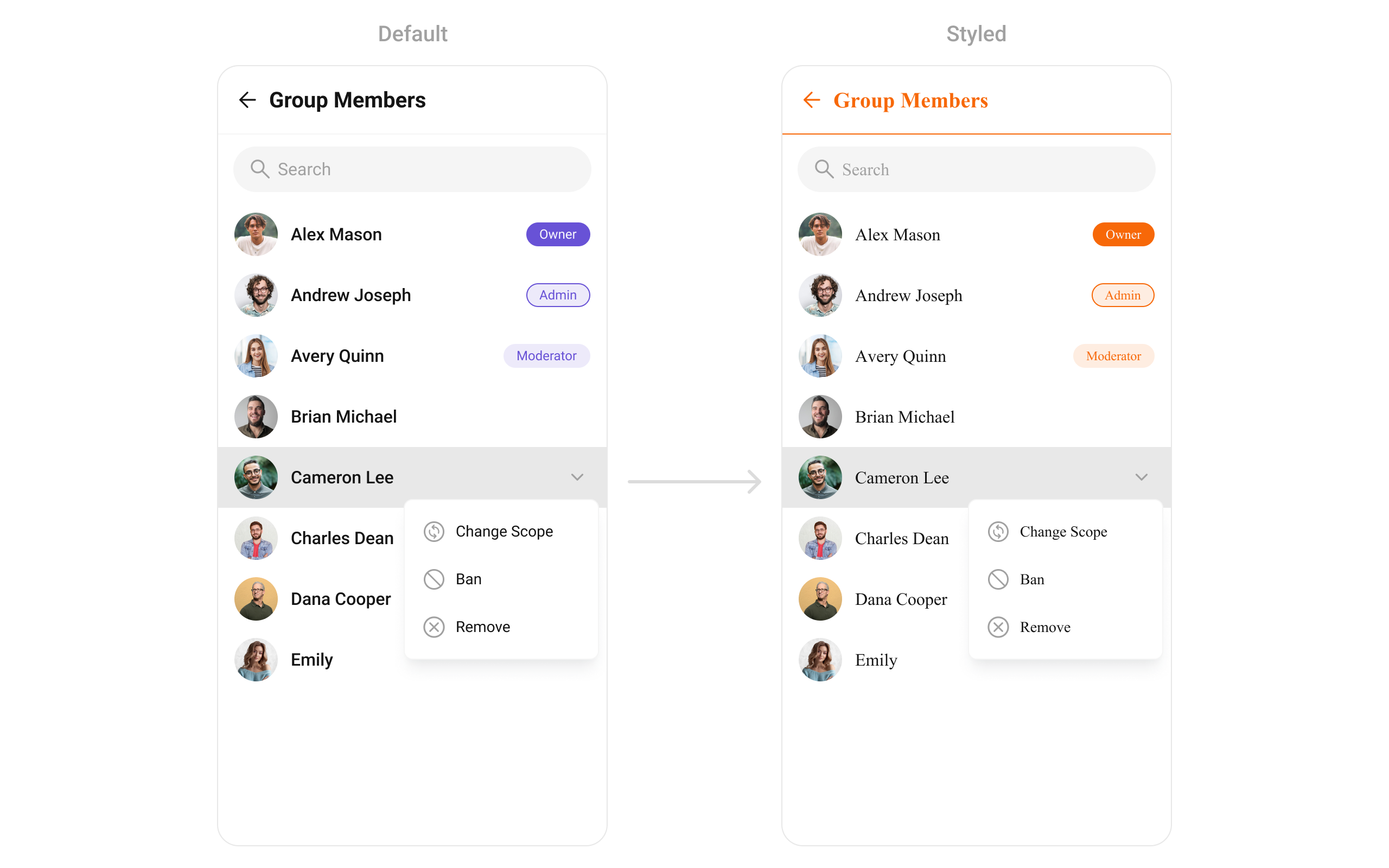
## Customization
To fit your app's design requirements, you can customize the appearance of the Groups widget. We provide exposed methods that allow you to modify the experience and behavior according to your specific needs.
### Style
You can set the `CometChatGroupMembersStyle` to the `CometChatGroupMembers` Widget to customize the styling.
```dart theme={null}
CometChatGroupMembers(
group: Group(guid: "", name: "", type: ""), // A group object is required to launch this widget.
style: CometChatGroupMembersStyle(
titleStyle: TextStyle(color: Color(0xFFF76808)),
separatorColor: Color(0xFFF76808),
ownerMemberScopeBackgroundColor: Color(0xFFF76808),
adminMemberScopeBackgroundColor: Color(0xFFFEEDE1),
adminMemberScopeBorder: Border.all(color: Color(0xFFF76808)),
adminMemberScopeTextColor: Color(0xFFF76808),
moderatorMemberScopeBackgroundColor: Color(0xFFFEEDE1),
moderatorMemberScopeTextColor: Color(0xFFF76808),
backIconColor: Color(0xFFF76808),
),
)
```
The `CometChatGroupMembers` widget is composed of the following BaseWidgets:
| Widgets | Description |
| ---------------------------------------------- | ----------------------------------------------------------------------------------------------------------------------------------------------------------------------------------------------------------------------------- |
| [CometChatListBase](/ui-kit/flutter/list-base) | `CometChatListBase` serves as a container widget equipped with a title (navigationBar), search functionality (search-bar), background settings, and a container for embedding a list widget. |
| [CometChatListItem](/ui-kit/flutter/list-item) | This widget renders information extracted from a `User` object onto a tile, featuring a title, subtitle, leading widget, and trailing widget. experience, facilitating seamless navigation and interaction within the widget. |
***
## Usage
### Integration
`CometChatGroupMembers` , as a Composite Widget, offers flexible integration options, allowing it to be launched directly via button clicks or any user-triggered action.
You can launch `CometChatGroupMembers` directly using `Navigator.push` , or you can define it as a widget within the `build` method of your `State` class.
##### 1. Using Navigator to Launch `CometChatGroupMembers`
```dart theme={null}
Navigator.push(context, MaterialPageRoute(builder: (context) => CometChatGroupMembers(group: Group(guid: "", name: "", type: "")))); // A group object is required to launch this widget.
```
##### 2. Embedding `CometChatGroupMembers` as a Widget in the build Method
```dart theme={null}
import 'package:cometchat_chat_uikit/cometchat_chat_uikit.dart';
import 'package:flutter/material.dart';
class GroupMembers extends StatefulWidget {
const GroupMembers({super.key});
@override
State createState() => _GroupMembersState();
}
class _GroupMembersState extends State {
@override
Widget build(BuildContext context) {
return Scaffold(
body: SafeArea(
child: CometChatGroupMembers(
group: Group(guid: "", name: "", type: ""),
) // A group object is required to launch this widget.
)
);
}
}
```
***
### Actions
[Actions](/ui-kit/flutter/components-overview#actions) dictate how a widget functions. They are divided into two types: Predefined and User-defined. You can override either type, allowing you to tailor the behavior of the widget to fit your specific needs.
##### 1. onItemTap
This method proves valuable when users seek to override onItemClick functionality within `CometChatGroupMembers` , empowering them with greater control and customization options.
The `onItemTap` action doesn't have a predefined behavior. You can override this action using the following code snippet.
```dart theme={null}
CometChatGroupMembers(
group: Group(guid: "", name: "", type: ""), // A group object is required to launch this widget.
onItemTap: (groupMember) {
// TODO("Not yet implemented")
},
)
```
***
##### 2. onItemLongPress
This method becomes invaluable when users seek to override long-click functionality within `CometChatGroupMembers` , offering them enhanced control and flexibility in their interactions.
The `onItemLongPress` action doesn't have a predefined behavior. You can override this action using the following code snippet.
```dart theme={null}
CometChatGroupMembers(
group: Group(guid: "", name: "", type: ""), // A group object is required to launch this widget.
onItemLongPress: (groupMember) {
// TODO("Not yet implemented")
},
)
```
***
##### 3. onBack
Enhance your application's functionality by leveraging the `onBack` feature. This capability allows you to customize the behavior associated with navigating back within your app. Utilize the provided code snippet to override default behaviors and tailor the user experience according to your specific requirements.
```dart theme={null}
CometChatGroupMembers(
group: Group(guid: "", name: "", type: ""), // A group object is required to launch this widget.
onBack: () {
// TODO("Not yet implemented")
},
)
```
***
##### 4. onError
You can customize this behavior by using the provided code snippet to override the `onError` and improve error handling.
```dart theme={null}
CometChatGroupMembers(
group: Group(guid: "", name: "", type: ""), // A group object is required to launch this widget.
onError: (e) {
// TODO("Not yet implemented")
},
)
```
***
##### 5. onSelection
When the `onSelection` event is triggered, it furnishes the list of selected members. This event can be invoked by any button or action within the interface. You have the flexibility to implement custom actions or behaviors based on the selected members.
This action does not come with any predefined behavior. However, you have the flexibility to override this event and tailor it to suit your needs using the following code snippet.
```dart theme={null}
CometChatGroupMembers(
group: Group(guid: "", name: "", type: ""), // A group object is required to launch this widget.
selectionMode: SelectionMode.multiple,
activateSelection: ActivateSelection.onClick,
onSelection: (groupMembersList) {
// TODO("Not yet implemented")
},
)
```
***
##### onLoad
Invoked when the list is successfully fetched and loaded, helping track component readiness..
```dart theme={null}
CometChatGroupMembers(
onLoad: (list) {
// print("members loaded: ${list.length}");
},
)
```
***
##### onEmpty
Called when the list is empty, enabling custom handling such as showing a placeholder message.
```dart theme={null}
CometChatGroupMembers(
onEmpty: () {
// print("Group Members empty");
},
)
```
***
### Filters
**Filters** allow you to customize the data displayed in a list within a `Widget` . You can filter the list based on your specific criteria, allowing for a more customized. Filters can be applied using `RequestBuilders` of Chat SDK.
##### 1. GroupMembersRequestBuilder
| Property | Description | Code |
| ------------------ | -------------------------------------------------------- | ------------------------ |
| **GUID** | Group ID for the group whose members are to be fetched. | `guid: String` |
| **Limit** | Number of results to limit the query. | `limit: int?` |
| **Search Keyword** | Keyword for searching members within the group. | `searchKeyword: String?` |
| **Scopes** | List of scopes for filtering members (e.g., moderators). | `scopes: List?` |
**Example**
In the example below, we are applying a filter to the Group List based on limit and scope.
```dart theme={null}
CometChatGroupMembers(
group: Group(guid: "", name: "", type: ""), // A group object is required to launch this widget.
groupMembersRequestBuilder: GroupMembersRequestBuilder("")
..limit = 10
)
```
##### 2. GroupMembersProtocol
The `GroupMembersProtocol` uses [GroupsRequestBuilder](/sdk/flutter/retrieve-groups) enables you to filter and customize the search list based on available parameters in GroupsRequestBuilder.
This feature allows you to keep uniformity between the displayed Group Members List and Searched Group Members List.
Here is the complete example for reference:
**Example**
```dart custom_protocol_builder.dart theme={null}
import 'package:cometchat_chat_uikit/cometchat_chat_uikit.dart';
class CustomProtocolBuilder extends GroupMembersBuilderProtocol {
const CustomProtocolBuilder(super.builder);
@override
GroupMembersRequest getRequest() {
return requestBuilder.build();
}
@override
GroupMembersRequest getSearchRequest(String val) {
requestBuilder.searchKeyword = val;
return requestBuilder.build();
}
}
```
```dart main.dart theme={null}
CometChatGroupMembers(
group: Group(guid: "", name: "", type: ""), // A group object is required to launch this widget.
groupMembersProtocol: CustomProtocolBuilder(GroupMembersRequestBuilder("")..searchKeyword = "searchKeyword"),
)
```
***
### Events
[Events](/ui-kit/flutter/components-overview#events) are emitted by a `Widget` . By using event you can extend existing functionality. Being global events, they can be applied in Multiple Locations and are capable of being Added or Removed.
Events emitted by the Join Group widget is as follows.
| Event | Description |
| ----------------------------- | ----------------------------------------------------------------- |
| **ccGroupMemberBanned** | Triggers when the group member banned from the group successfully |
| **ccGroupMemberKicked** | Triggers when the group member kicked from the group successfully |
| **ccGroupMemberScopeChanged** | Triggers when the group member scope is changed in the group |
**Example**
```dart your_screen.dart theme={null}
import 'package:cometchat_chat_uikit/cometchat_chat_uikit.dart';
import 'package:cometchat_sdk/models/action.dart' as cc;
import 'package:flutter/material.dart';
class YourScreen extends StatefulWidget {
const YourScreen({super.key});
@override
State createState() => _YourScreenState();
}
class _YourScreenState extends State with CometChatGroupEventListener {
@override
void initState() {
super.initState();
CometChatGroupEvents.addGroupsListener("listenerId", this); // Add the listener
}
@override
void dispose(){
super.dispose();
CometChatGroupEvents.removeGroupsListener("listenerId"); // Remove the listener
}
@override
void ccGroupMemberScopeChanged(cc.Action message, User updatedUser, String scopeChangedTo, String scopeChangedFrom, Group group) {
// TODO("Not yet implemented")
}
@override
void ccGroupMemberBanned(cc.Action message, User bannedUser, User bannedBy, Group bannedFrom) {
// TODO("Not yet implemented")
}
@override
void ccGroupMemberKicked(cc.Action message, User kickedUser, User kickedBy, Group kickedFrom) {
// TODO("Not yet implemented")
}
@override
Widget build(BuildContext context) {
return const Placeholder();
}
}
```
***
## Customization
To fit your app's design requirements, you can customize the appearance of the Groups widget. We provide exposed methods that allow you to modify the experience and behavior according to your specific needs.
### Style
You can set the `CometChatGroupMembersStyle` to the `CometChatGroupMembers` Widget to customize the styling.
```dart theme={null}
CometChatGroupMembers(
group: Group(guid: "", name: "", type: ""), // A group object is required to launch this widget.
style: CometChatGroupMembersStyle(
titleStyle: TextStyle(color: Color(0xFFF76808)),
separatorColor: Color(0xFFF76808),
ownerMemberScopeBackgroundColor: Color(0xFFF76808),
adminMemberScopeBackgroundColor: Color(0xFFFEEDE1),
adminMemberScopeBorder: Border.all(color: Color(0xFFF76808)),
adminMemberScopeTextColor: Color(0xFFF76808),
moderatorMemberScopeBackgroundColor: Color(0xFFFEEDE1),
moderatorMemberScopeTextColor: Color(0xFFF76808),
backIconColor: Color(0xFFF76808),
),
)
```
 ***
### Functionality
These are a set of small functional customizations that allow you to fine-tune the overall experience of the widget. With these, you can change text, set custom icons, and toggle the visibility of UI elements.
```dart theme={null}
CometChatGroupMembers(
group: Group(guid: "", name: "", type: ""), // A group object is required to launch this widget.
hideSeparator: true,
hideSearch: true,
showBackButton: false
)
```
## List of properties exposed by `CometChatGroupMembers`
| Property | Data Type | Description |
| ---------------------------- | ----------------------------------------------------------------------------------------------------- | ------------------------------------------------------------------------- |
| `groupMembersProtocol` | `GroupMembersBuilderProtocol?` | Custom request builder protocol for fetching group members. |
| `groupMembersRequestBuilder` | `GroupMembersRequestBuilder?` | Custom request builder for fetching group members. |
| `subtitleView` | `Widget? Function(BuildContext, GroupMember)?` | Widget to set subtitle for each group member. |
| `hideSeparator` | `bool?` | Toggle visibility of separator. |
| `listItemView` | `Widget Function(GroupMember)?` | Custom view for each group member item. |
| `style` | `CometChatGroupMembersStyle?` | Sets style for \[CometChatGroupMembers]. |
| `controller` | `ScrollController?` | Sets controller for the list. |
| `options` | `List? Function(Group, GroupMember, CometChatGroupMembersController, BuildContext)?` | Options visible at the slide of each group member. |
| `searchPlaceholder` | `String?` | Placeholder text for the search input. |
| `backButton` | `Widget?` | Widget for the back button in the app bar. |
| `showBackButton` | `bool` | Flag to show/hide the back button. |
| `searchBoxIcon` | `Widget?` | Widget for the search box icon. |
| `hideSearch` | `bool` | Flag to show/hide the search input box. |
| `selectionMode` | `SelectionMode?` | Specifies mode group members module is opening in. |
| `onSelection` | `Function(List?)?` | Callback for handling group member selection. |
| `loadingStateView` | `WidgetBuilder?` | View displayed during loading state. |
| `emptyStateView` | `WidgetBuilder?` | View displayed when the list is empty. |
| `errorStateView` | `WidgetBuilder?` | View displayed when an error occurs. |
| `hideError` | `bool?` | Toggle visibility of error dialog. |
| `stateCallBack` | `Function(CometChatGroupMembersController)?` | Callback to access controller functions from the parent. |
| `appBarOptions` | `List?` | Options available in the app bar. |
| `group` | `Group` | Group object passed to fetch members. |
| `trailingView` | `Function(BuildContext, GroupMember)?` | Custom widget for the trailing section of the group member list item. |
| `submitIcon` | `Widget?` | Widget for the submit icon. |
| `selectIcon` | `Widget?` | Widget for the selection icon. |
| `onBack` | `VoidCallback?` | Callback triggered when going back. |
| `onItemTap` | `Function(GroupMember)?` | Callback triggered when tapping a group member item. |
| `onItemLongPress` | `Function(GroupMember)?` | Callback triggered on long press of a group member item. |
| `activateSelection` | `ActivateSelection?` | Lets the widget know if group members can be selected. |
| `onError` | `OnError?` | Callback for handling errors. |
| `height` | `double?` | Height of the widget. |
| `width` | `double?` | Width of the widget. |
| `controllerTag` | `String?` | Tag for accessing the widget's GetXController. |
| `hideAppbar` | `bool?` | Flag to hide the app bar. |
| `searchKeyword` | `String?` | Keyword to fetch the initial list with. |
| `onLoad` | `OnLoad?` | Callback triggered when the list is loaded. |
| `onEmpty` | `OnEmpty?` | Callback triggered when the list is empty. |
| `leadingStateView` | `Widget? Function(BuildContext, GroupMember)?` | Widget for the leading section of each group member. |
| `titleView` | `Widget? Function(BuildContext, GroupMember)?` | Custom title view for each group member. |
| `hideUserStatus` | `bool?` | Flag to hide the user status indicator on the avatar. |
| `hideBanMemberOption` | `bool?` | Flag to hide the ban member option. |
| `hideKickMemberOption` | `bool?` | Flag to hide the kick member option. |
| `hideScopeChangeOption` | `bool?` | Flag to hide the scope change option. |
| `setOptions` | `List? Function(Group, GroupMember, CometChatGroupMembersController, BuildContext)?` | List of actions available on long press of group member item. |
| `addOptions` | `List? Function(Group, GroupMember, CometChatGroupMembersController, BuildContext)?` | Adds to the current list of actions on long press of a group member item. |
***
### Advanced
For advanced-level customization, you can set custom widgets to the widget. This lets you tailor each aspect of the widget to fit your exact needs and application aesthetics. You can create and define your own widgets and then incorporate those into the widget.
The `CometChatGroupMembers` widget does not provide additional functionalities beyond this level of customization.
#### setOptions
Defines a set of available actions that users can perform when they interact with a group member item.
* Provide actions like "View Profile", "Send Message", "Remove from Group".
* Restrict certain actions to admins (e.g., "Promote to Admin", "Ban User").
By customizing these options, developers can provide a streamlined and contextually relevant user experience
```dart theme={null}
CometChatGroupMembers(
setOptions: (group, groupMember, controller, context) {
// return options
},
)
```
***
#### addOptions
Adds custom actions to the existing options available when interacting with a group member.
* Extend functionality by adding "Block User", "Report User", or "View Activity".
* Customize actions based on member roles.
```dart theme={null}
CometChatGroupMembers(
addOptions: (group, groupMember, controller, context) {
// return options
},
)
```
***
#### loadingStateView
Displays a custom loading view while group members are being fetched.
* Show a loading spinner with "Fetching group members...".
* Implement a skeleton loader for a smoother UI experience.
```dart theme={null}
CometChatGroupMembers(
loadingStateView: (context) {
// return loading view
},
)
```
***
#### emptyStateView
Configures a view to be displayed when no group members are found.
* Display a message like "No members in this group yet.".
* Show a button to Invite Members.
```dart theme={null}
CometChatGroupMembers(
emptyStateView: (context) {
// return empty view
},
)
```
***
#### errorStateView
Defines a custom error state view when there is an issue loading group members.
* Display a retry button with "Failed to load members. Tap to retry.".
* Show an illustration for a better user experience.
```dart theme={null}
CometChatGroupMembers(
errorStateView: (context) {
// return error view
},
)
```
***
#### leadingView
Sets a custom leading view for each group member item, usually used for profile images or avatars.
* Show a circular avatar with an online/offline indicator.
* Add a role-based badge (Admin, Moderator, Member).
```dart theme={null}
CometChatGroupMembers(
leadingView: (context, groupMember) {
// return leading view
},
)
```
***
#### titleView
Customizes the title view, typically displaying the member's name.
* Customize fonts, colors, or styles for usernames.
* Add role-specific indicators like "(Group Admin)".
```dart theme={null}
CometChatGroupMembers(
titleView: (context, groupMember) {
// return title view
},
)
```
***
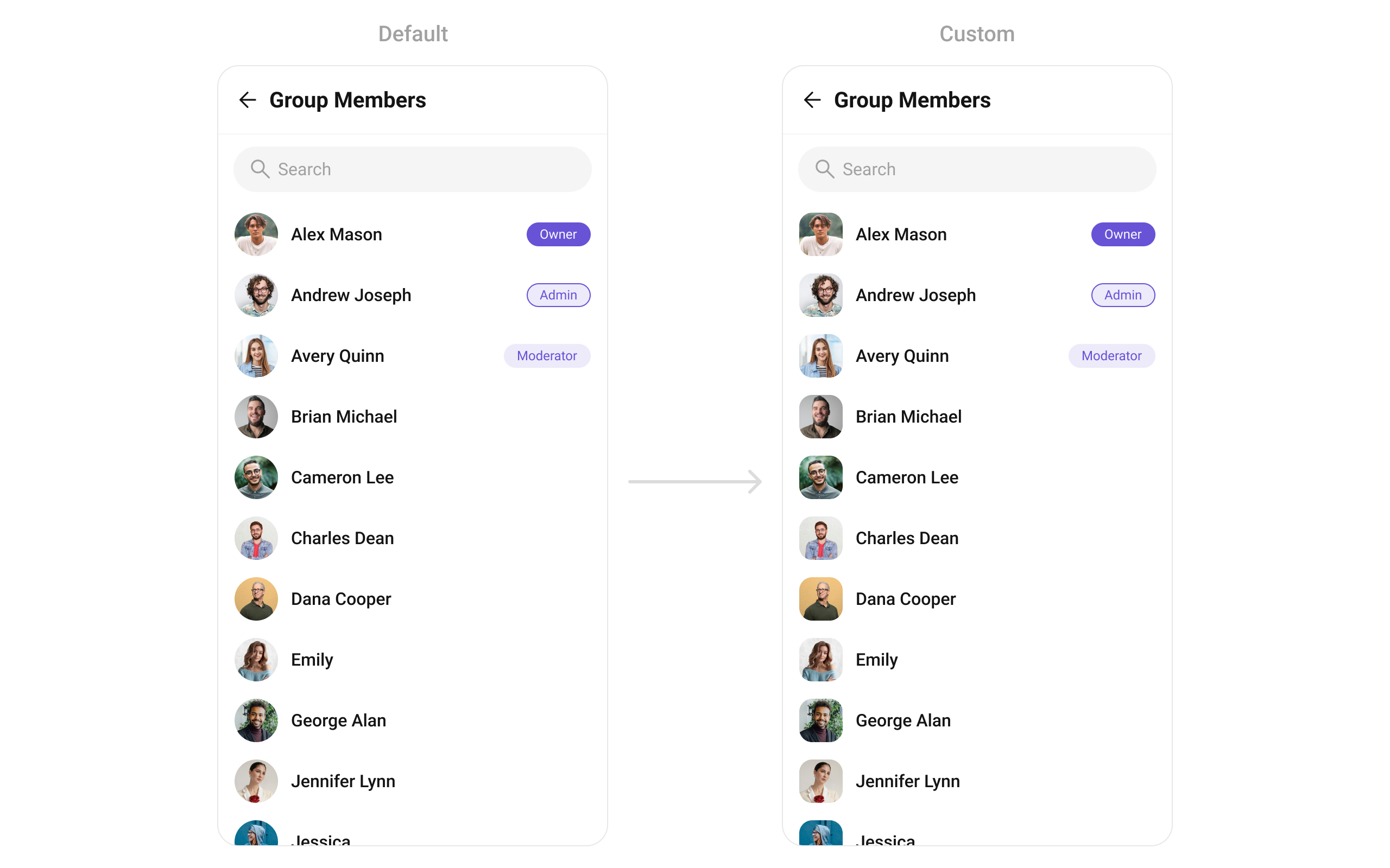
#### ListItemView
With this function, you can assign a custom ListItem to the `CometChatGroupMembers` Widget.
```dart widget theme={null}
CometChatGroupMembers(
group: Group(guid: "", name: "", type: ""), // A group object is required to launch this widget.
listItemView: (groupMember) {
return Placeholder(); // Replace this placeholder with your custom widget.
},
)
```
Here is the complete example for reference:
**Example**
You can indeed create a custom widget named `custom_list_item.dart` for more complex or unique list items.
```dart custom_list_item.dart theme={null}
Widget _getTailView(GroupMember groupMember, Group group) {
Color? backgroundColor;
BoxBorder? border;
String scope = groupMember.scope ?? GroupMemberScope.participant;
Color? textColor;
TextStyle? textStyle;
if (groupMember.uid == group.owner) {
scope = GroupMemberScope.owner;
backgroundColor = Color(0xFF6852D6);
textColor = Colors.white;
} else if (scope == GroupMemberScope.admin) {
backgroundColor = Color(0xFFEDEAFA);
border = Border.all(color: Color(0xFF6852D6), width: 1);
textColor = Color(0xFF6852D6);
} else if (scope == GroupMemberScope.moderator) {
backgroundColor = Color(0xFFEDEAFA);
textColor = Color(0xFF6852D6);
} else {
return const SizedBox();
}
return Container(
alignment: Alignment.center,
padding: EdgeInsets.symmetric(horizontal: 12, vertical: 4 ?? 0),
decoration: BoxDecoration(
color: backgroundColor,
border: border,
borderRadius: BorderRadius.circular(1000),
),
child: Text(
scope.capitalizeFirst ?? "",
style: TextStyle(
fontSize: 12, fontWeight: FontWeight.w400, color: textColor)
.merge(textStyle)
.copyWith(color: textColor),
),
);
}
Widget getCustomListItemView(
GroupMember member,
Group group,
BuildContext context,
) {
Widget? subtitle;
Widget? tail;
Color? backgroundColor;
Widget? icon;
tail = _getTailView(member, group);
StatusIndicatorUtils statusIndicatorUtils =
StatusIndicatorUtils.getStatusIndicatorFromParams(
context: context,
groupMember: member,
onlineStatusIndicatorColor: Color(0xFF09C26F),
usersStatusVisibility: true,
);
backgroundColor = statusIndicatorUtils.statusIndicatorColor;
icon = statusIndicatorUtils.icon;
return Padding(
padding: EdgeInsets.symmetric(vertical: 8, horizontal: 16),
child: CometChatListItem(
id: member.uid,
avatarName: member.name,
avatarURL: member.avatar,
title: member.name,
key: UniqueKey(),
subtitleView: subtitle,
tailView: tail,
avatarStyle: const CometChatAvatarStyle(
borderRadius: BorderRadius.all(Radius.circular(12)),
),
avatarHeight: 40,
avatarWidth: 40,
statusIndicatorColor: backgroundColor,
statusIndicatorIcon: icon,
hideSeparator: true,
style: ListItemStyle(
background: Colors.transparent,
titleStyle: TextStyle(
fontSize: 16,
fontWeight: FontWeight.w500,
color: Color(0xFF141414)),
)),
);
}
```
```dart main.dart theme={null}
CometChatGroupMembers(
group: Group(guid: "", name: "", type: ""), // A group object is required to launch this widget.
listItemView: (member) {
return getCustomListItemView(member, controller.group!, context);
},
)
```
***
### Functionality
These are a set of small functional customizations that allow you to fine-tune the overall experience of the widget. With these, you can change text, set custom icons, and toggle the visibility of UI elements.
```dart theme={null}
CometChatGroupMembers(
group: Group(guid: "", name: "", type: ""), // A group object is required to launch this widget.
hideSeparator: true,
hideSearch: true,
showBackButton: false
)
```
## List of properties exposed by `CometChatGroupMembers`
| Property | Data Type | Description |
| ---------------------------- | ----------------------------------------------------------------------------------------------------- | ------------------------------------------------------------------------- |
| `groupMembersProtocol` | `GroupMembersBuilderProtocol?` | Custom request builder protocol for fetching group members. |
| `groupMembersRequestBuilder` | `GroupMembersRequestBuilder?` | Custom request builder for fetching group members. |
| `subtitleView` | `Widget? Function(BuildContext, GroupMember)?` | Widget to set subtitle for each group member. |
| `hideSeparator` | `bool?` | Toggle visibility of separator. |
| `listItemView` | `Widget Function(GroupMember)?` | Custom view for each group member item. |
| `style` | `CometChatGroupMembersStyle?` | Sets style for \[CometChatGroupMembers]. |
| `controller` | `ScrollController?` | Sets controller for the list. |
| `options` | `List? Function(Group, GroupMember, CometChatGroupMembersController, BuildContext)?` | Options visible at the slide of each group member. |
| `searchPlaceholder` | `String?` | Placeholder text for the search input. |
| `backButton` | `Widget?` | Widget for the back button in the app bar. |
| `showBackButton` | `bool` | Flag to show/hide the back button. |
| `searchBoxIcon` | `Widget?` | Widget for the search box icon. |
| `hideSearch` | `bool` | Flag to show/hide the search input box. |
| `selectionMode` | `SelectionMode?` | Specifies mode group members module is opening in. |
| `onSelection` | `Function(List?)?` | Callback for handling group member selection. |
| `loadingStateView` | `WidgetBuilder?` | View displayed during loading state. |
| `emptyStateView` | `WidgetBuilder?` | View displayed when the list is empty. |
| `errorStateView` | `WidgetBuilder?` | View displayed when an error occurs. |
| `hideError` | `bool?` | Toggle visibility of error dialog. |
| `stateCallBack` | `Function(CometChatGroupMembersController)?` | Callback to access controller functions from the parent. |
| `appBarOptions` | `List?` | Options available in the app bar. |
| `group` | `Group` | Group object passed to fetch members. |
| `trailingView` | `Function(BuildContext, GroupMember)?` | Custom widget for the trailing section of the group member list item. |
| `submitIcon` | `Widget?` | Widget for the submit icon. |
| `selectIcon` | `Widget?` | Widget for the selection icon. |
| `onBack` | `VoidCallback?` | Callback triggered when going back. |
| `onItemTap` | `Function(GroupMember)?` | Callback triggered when tapping a group member item. |
| `onItemLongPress` | `Function(GroupMember)?` | Callback triggered on long press of a group member item. |
| `activateSelection` | `ActivateSelection?` | Lets the widget know if group members can be selected. |
| `onError` | `OnError?` | Callback for handling errors. |
| `height` | `double?` | Height of the widget. |
| `width` | `double?` | Width of the widget. |
| `controllerTag` | `String?` | Tag for accessing the widget's GetXController. |
| `hideAppbar` | `bool?` | Flag to hide the app bar. |
| `searchKeyword` | `String?` | Keyword to fetch the initial list with. |
| `onLoad` | `OnLoad?` | Callback triggered when the list is loaded. |
| `onEmpty` | `OnEmpty?` | Callback triggered when the list is empty. |
| `leadingStateView` | `Widget? Function(BuildContext, GroupMember)?` | Widget for the leading section of each group member. |
| `titleView` | `Widget? Function(BuildContext, GroupMember)?` | Custom title view for each group member. |
| `hideUserStatus` | `bool?` | Flag to hide the user status indicator on the avatar. |
| `hideBanMemberOption` | `bool?` | Flag to hide the ban member option. |
| `hideKickMemberOption` | `bool?` | Flag to hide the kick member option. |
| `hideScopeChangeOption` | `bool?` | Flag to hide the scope change option. |
| `setOptions` | `List? Function(Group, GroupMember, CometChatGroupMembersController, BuildContext)?` | List of actions available on long press of group member item. |
| `addOptions` | `List? Function(Group, GroupMember, CometChatGroupMembersController, BuildContext)?` | Adds to the current list of actions on long press of a group member item. |
***
### Advanced
For advanced-level customization, you can set custom widgets to the widget. This lets you tailor each aspect of the widget to fit your exact needs and application aesthetics. You can create and define your own widgets and then incorporate those into the widget.
The `CometChatGroupMembers` widget does not provide additional functionalities beyond this level of customization.
#### setOptions
Defines a set of available actions that users can perform when they interact with a group member item.
* Provide actions like "View Profile", "Send Message", "Remove from Group".
* Restrict certain actions to admins (e.g., "Promote to Admin", "Ban User").
By customizing these options, developers can provide a streamlined and contextually relevant user experience
```dart theme={null}
CometChatGroupMembers(
setOptions: (group, groupMember, controller, context) {
// return options
},
)
```
***
#### addOptions
Adds custom actions to the existing options available when interacting with a group member.
* Extend functionality by adding "Block User", "Report User", or "View Activity".
* Customize actions based on member roles.
```dart theme={null}
CometChatGroupMembers(
addOptions: (group, groupMember, controller, context) {
// return options
},
)
```
***
#### loadingStateView
Displays a custom loading view while group members are being fetched.
* Show a loading spinner with "Fetching group members...".
* Implement a skeleton loader for a smoother UI experience.
```dart theme={null}
CometChatGroupMembers(
loadingStateView: (context) {
// return loading view
},
)
```
***
#### emptyStateView
Configures a view to be displayed when no group members are found.
* Display a message like "No members in this group yet.".
* Show a button to Invite Members.
```dart theme={null}
CometChatGroupMembers(
emptyStateView: (context) {
// return empty view
},
)
```
***
#### errorStateView
Defines a custom error state view when there is an issue loading group members.
* Display a retry button with "Failed to load members. Tap to retry.".
* Show an illustration for a better user experience.
```dart theme={null}
CometChatGroupMembers(
errorStateView: (context) {
// return error view
},
)
```
***
#### leadingView
Sets a custom leading view for each group member item, usually used for profile images or avatars.
* Show a circular avatar with an online/offline indicator.
* Add a role-based badge (Admin, Moderator, Member).
```dart theme={null}
CometChatGroupMembers(
leadingView: (context, groupMember) {
// return leading view
},
)
```
***
#### titleView
Customizes the title view, typically displaying the member's name.
* Customize fonts, colors, or styles for usernames.
* Add role-specific indicators like "(Group Admin)".
```dart theme={null}
CometChatGroupMembers(
titleView: (context, groupMember) {
// return title view
},
)
```
***
#### ListItemView
With this function, you can assign a custom ListItem to the `CometChatGroupMembers` Widget.
```dart widget theme={null}
CometChatGroupMembers(
group: Group(guid: "", name: "", type: ""), // A group object is required to launch this widget.
listItemView: (groupMember) {
return Placeholder(); // Replace this placeholder with your custom widget.
},
)
```
Here is the complete example for reference:
**Example**
You can indeed create a custom widget named `custom_list_item.dart` for more complex or unique list items.
```dart custom_list_item.dart theme={null}
Widget _getTailView(GroupMember groupMember, Group group) {
Color? backgroundColor;
BoxBorder? border;
String scope = groupMember.scope ?? GroupMemberScope.participant;
Color? textColor;
TextStyle? textStyle;
if (groupMember.uid == group.owner) {
scope = GroupMemberScope.owner;
backgroundColor = Color(0xFF6852D6);
textColor = Colors.white;
} else if (scope == GroupMemberScope.admin) {
backgroundColor = Color(0xFFEDEAFA);
border = Border.all(color: Color(0xFF6852D6), width: 1);
textColor = Color(0xFF6852D6);
} else if (scope == GroupMemberScope.moderator) {
backgroundColor = Color(0xFFEDEAFA);
textColor = Color(0xFF6852D6);
} else {
return const SizedBox();
}
return Container(
alignment: Alignment.center,
padding: EdgeInsets.symmetric(horizontal: 12, vertical: 4 ?? 0),
decoration: BoxDecoration(
color: backgroundColor,
border: border,
borderRadius: BorderRadius.circular(1000),
),
child: Text(
scope.capitalizeFirst ?? "",
style: TextStyle(
fontSize: 12, fontWeight: FontWeight.w400, color: textColor)
.merge(textStyle)
.copyWith(color: textColor),
),
);
}
Widget getCustomListItemView(
GroupMember member,
Group group,
BuildContext context,
) {
Widget? subtitle;
Widget? tail;
Color? backgroundColor;
Widget? icon;
tail = _getTailView(member, group);
StatusIndicatorUtils statusIndicatorUtils =
StatusIndicatorUtils.getStatusIndicatorFromParams(
context: context,
groupMember: member,
onlineStatusIndicatorColor: Color(0xFF09C26F),
usersStatusVisibility: true,
);
backgroundColor = statusIndicatorUtils.statusIndicatorColor;
icon = statusIndicatorUtils.icon;
return Padding(
padding: EdgeInsets.symmetric(vertical: 8, horizontal: 16),
child: CometChatListItem(
id: member.uid,
avatarName: member.name,
avatarURL: member.avatar,
title: member.name,
key: UniqueKey(),
subtitleView: subtitle,
tailView: tail,
avatarStyle: const CometChatAvatarStyle(
borderRadius: BorderRadius.all(Radius.circular(12)),
),
avatarHeight: 40,
avatarWidth: 40,
statusIndicatorColor: backgroundColor,
statusIndicatorIcon: icon,
hideSeparator: true,
style: ListItemStyle(
background: Colors.transparent,
titleStyle: TextStyle(
fontSize: 16,
fontWeight: FontWeight.w500,
color: Color(0xFF141414)),
)),
);
}
```
```dart main.dart theme={null}
CometChatGroupMembers(
group: Group(guid: "", name: "", type: ""), // A group object is required to launch this widget.
listItemView: (member) {
return getCustomListItemView(member, controller.group!, context);
},
)
```
 ***
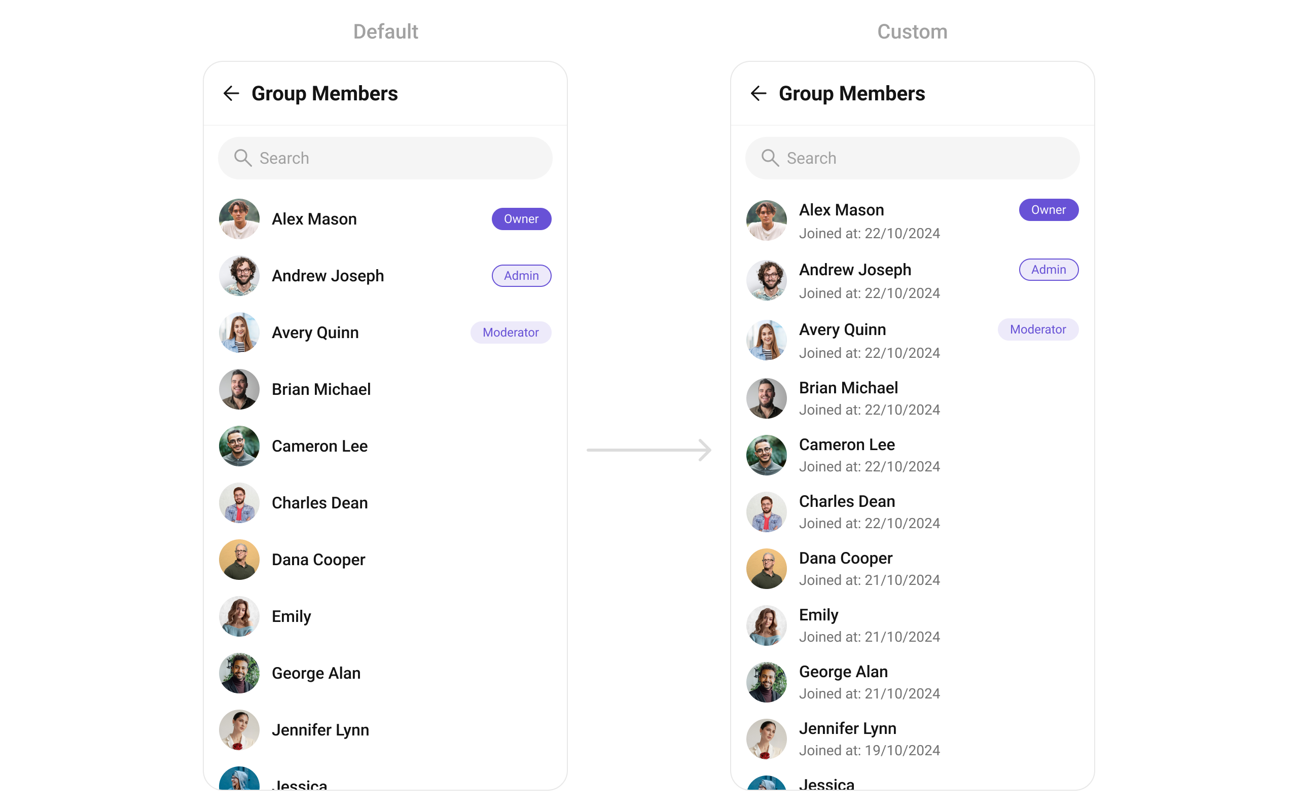
#### SubtitleView
You can customize the subtitle view for each item to meet your specific preferences and needs.
```dart widget theme={null}
CometChatGroupMembers(
group: Group(guid: "", name: "", type: ""), // A group object is required to launch this widget.
subtitleView: (context, groupMember) {
return Placeholder(); // Replace this placeholder with your custom widget.
},
)
```
Here is the complete example for reference:
**Example**
```dart main.dart theme={null}
CometChatGroupMembers(
group: Group(guid: "", name: "", type: ""), // A group object is required to launch this widget.
subtitleView: (context, member) {
String subtitle = "";
final dateTime = member.joinedAt ?? DateTime.now();
subtitle = "Joined at ${DateFormat('dd/MM/yyyy').format(dateTime)}";
return Text(subtitle,
style: TextStyle(
color: Color(0xFF727272),
fontSize: 14,
fontWeight: FontWeight.w400,
),
);
},
)
```
***
#### SubtitleView
You can customize the subtitle view for each item to meet your specific preferences and needs.
```dart widget theme={null}
CometChatGroupMembers(
group: Group(guid: "", name: "", type: ""), // A group object is required to launch this widget.
subtitleView: (context, groupMember) {
return Placeholder(); // Replace this placeholder with your custom widget.
},
)
```
Here is the complete example for reference:
**Example**
```dart main.dart theme={null}
CometChatGroupMembers(
group: Group(guid: "", name: "", type: ""), // A group object is required to launch this widget.
subtitleView: (context, member) {
String subtitle = "";
final dateTime = member.joinedAt ?? DateTime.now();
subtitle = "Joined at ${DateFormat('dd/MM/yyyy').format(dateTime)}";
return Text(subtitle,
style: TextStyle(
color: Color(0xFF727272),
fontSize: 14,
fontWeight: FontWeight.w400,
),
);
},
)
```
 ***
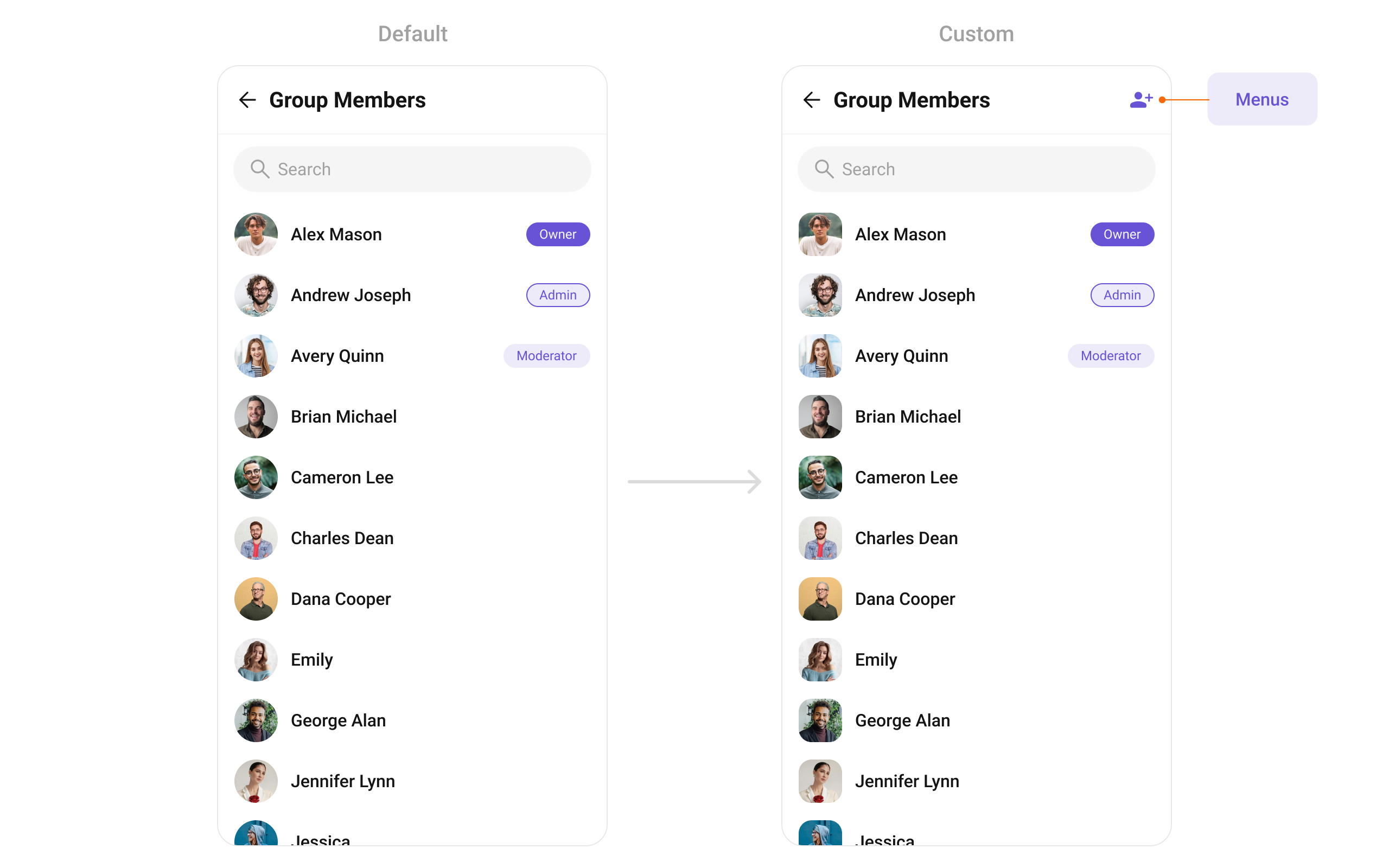
#### AppBarOptions
You can set the Custom `appBarOptions` to the `CometChatGroupMembers` widget.
```dart widget theme={null}
CometChatGroupMembers(
group: Group(guid: "", name: "", type: ""), // A group object is required to launch this widget.
appBarOptions: [
Placeholder(),
Placeholder(),
Placeholder()
] // Replace this list of placeholder widgets with your list of custom widgets.
)
```
Here is the complete example for reference:
**Example**
```dart theme={null}
CometChatGroupMembers(
group: Group(guid: "", name: "", type: ""), // A group object is required to launch this widget.
appBarOptions: [
IconButton(
onPressed: () {},
icon: Icon(
Icons.person_add_alt_1,
color: Color(0xFF6852D6),
),
),
], // Replaced the list of placeholder widgets with a list of custom widgets.
)
```
***
#### AppBarOptions
You can set the Custom `appBarOptions` to the `CometChatGroupMembers` widget.
```dart widget theme={null}
CometChatGroupMembers(
group: Group(guid: "", name: "", type: ""), // A group object is required to launch this widget.
appBarOptions: [
Placeholder(),
Placeholder(),
Placeholder()
] // Replace this list of placeholder widgets with your list of custom widgets.
)
```
Here is the complete example for reference:
**Example**
```dart theme={null}
CometChatGroupMembers(
group: Group(guid: "", name: "", type: ""), // A group object is required to launch this widget.
appBarOptions: [
IconButton(
onPressed: () {},
icon: Icon(
Icons.person_add_alt_1,
color: Color(0xFF6852D6),
),
),
], // Replaced the list of placeholder widgets with a list of custom widgets.
)
```
 ***
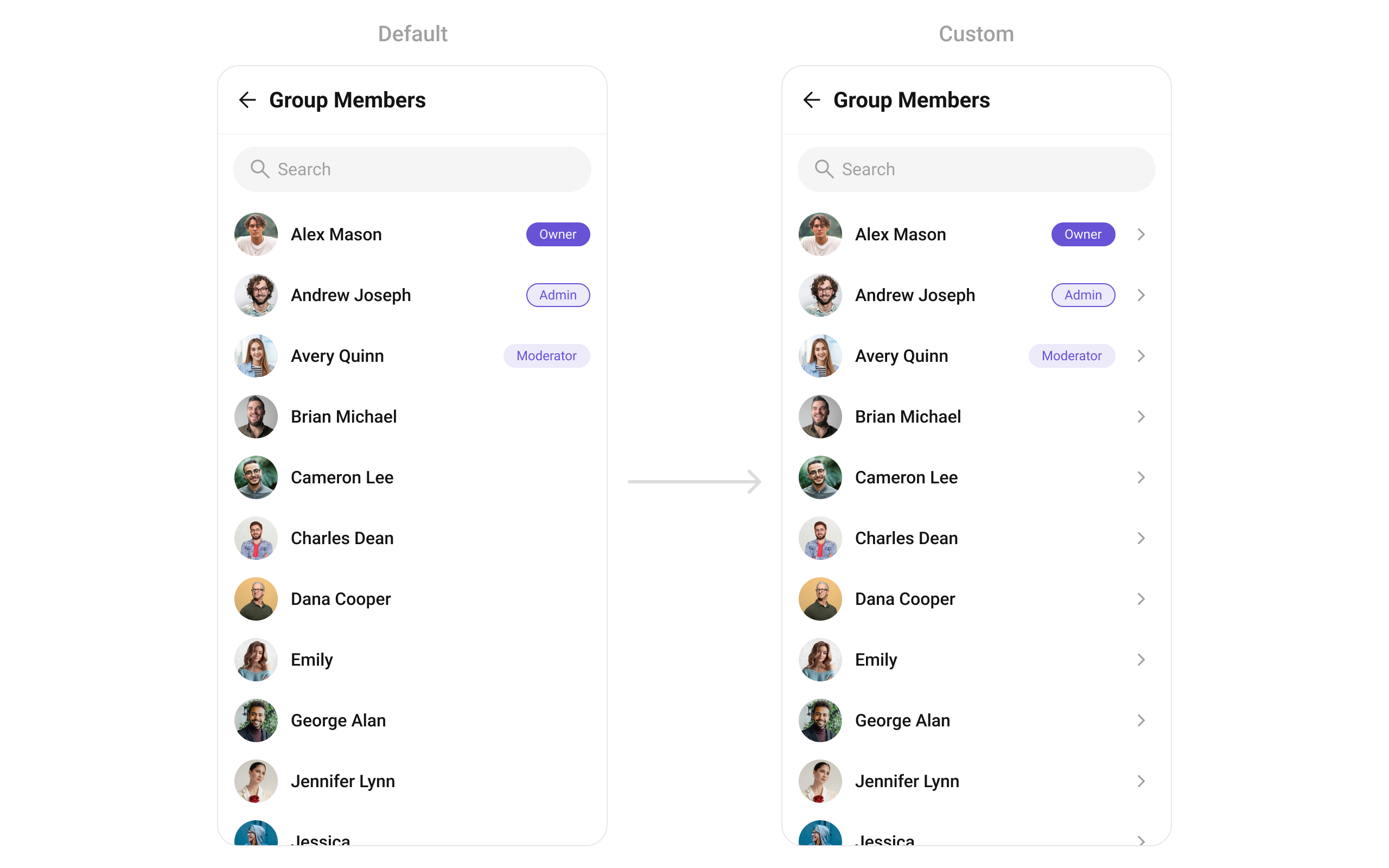
#### trailingView
Used to generate a custom trailing widget for the `CometChatGroupMembers` widget. You can add a Tail widget using the following method.
```dart widget theme={null}
CometChatGroupMembers(
group: Group(guid: "", name: "", type: ""), // A group object is required to launch this widget.
trailingView: (context, groupMembers) {
return Placeholder(); // Replace this placeholder with your custom widget.
},
)
```
Here is the complete example for reference:
**Example**
```dart main.dart theme={null}
CometChatGroupMembers(
group: Group(guid: "", name: "", type: ""), // A group object is required to launch this widget.
trailingView: (context, groupMember) {
Color? backgroundColor = Color(0xFFEDEAFA);
BoxBorder? border = Border.all(color: Color(0xFF6852D6), width: 1);
String scope = groupMember.scope ?? GroupMemberScope.participant;
Color? textColor = Color(0xFF6852D6);
if (groupMember.uid == group.owner){
scope = GroupMemberScope.owner;
}
return Container(
alignment: Alignment.center,
padding: EdgeInsets.symmetric(
horizontal: 12, vertical:4 ?? 0),
decoration: BoxDecoration(
color: backgroundColor,
border: border,
borderRadius:
BorderRadius.circular(1000),
),
child: Text(
scope.capitalizeFirst ?? "",
style:TextStyle(
fontSize: 12,
fontWeight: FontWeight.w400,
color: textColor)
),
);
},
);
```
***
#### trailingView
Used to generate a custom trailing widget for the `CometChatGroupMembers` widget. You can add a Tail widget using the following method.
```dart widget theme={null}
CometChatGroupMembers(
group: Group(guid: "", name: "", type: ""), // A group object is required to launch this widget.
trailingView: (context, groupMembers) {
return Placeholder(); // Replace this placeholder with your custom widget.
},
)
```
Here is the complete example for reference:
**Example**
```dart main.dart theme={null}
CometChatGroupMembers(
group: Group(guid: "", name: "", type: ""), // A group object is required to launch this widget.
trailingView: (context, groupMember) {
Color? backgroundColor = Color(0xFFEDEAFA);
BoxBorder? border = Border.all(color: Color(0xFF6852D6), width: 1);
String scope = groupMember.scope ?? GroupMemberScope.participant;
Color? textColor = Color(0xFF6852D6);
if (groupMember.uid == group.owner){
scope = GroupMemberScope.owner;
}
return Container(
alignment: Alignment.center,
padding: EdgeInsets.symmetric(
horizontal: 12, vertical:4 ?? 0),
decoration: BoxDecoration(
color: backgroundColor,
border: border,
borderRadius:
BorderRadius.circular(1000),
),
child: Text(
scope.capitalizeFirst ?? "",
style:TextStyle(
fontSize: 12,
fontWeight: FontWeight.w400,
color: textColor)
),
);
},
);
```
 ***
***